Mastering Blog Pages Design for UX and SEO

Great blog page design is more than just picking pretty colors and fonts. It's the silent workhorse that can turn a first-time visitor into a dedicated reader. Think of your blog's layout as the foundation of a conversation—it can either invite someone in or make them turn around and leave.
Why Blog Pages Design Is Your Ultimate Growth Tool

When someone lands on your blog, you have just a few seconds to make a good impression. A clean, thoughtful layout is your best shot at getting them to stick around. It tells them your content will be just as clear and organized as the page it’s on.
This is where good design directly impacts User Experience (UX) and Search Engine Optimization (SEO). If your page is intuitive and easy to read, people will stay longer. That tells search engines like Google that you’re providing real value, which can help your rankings. On the flip side, a confusing or clunky design sends people running, signaling to Google that your page isn't helpful.
To nail this, it helps to think about your blog's design in terms of a few core pillars. Each one has a specific job to do, and they all work together to create a page that not only looks good but performs even better.
Here’s a quick breakdown of what those pillars are and what they aim to achieve.
Core Pillars of High-Converting Blog Design
| Pillar | Primary Goal | Key Metric Impact |
|---|---|---|
| Readability & Scannability | Make content easy to consume quickly. | Lower Bounce Rate, Higher Time on Page |
| Visual Hierarchy | Guide the reader's eye to key information. | Improved User Engagement |
| Brand Consistency | Build trust and reinforce brand identity. | Increased Brand Recall & Loyalty |
| Mobile Responsiveness | Ensure a seamless experience on any device. | Better Mobile SEO Rankings, Higher Traffic |
| Page Speed & Performance | Load content instantly to avoid frustration. | Lower Bounce Rate, Higher Conversion Rate |
Getting these elements right is the secret to a blog that doesn't just attract visitors, but keeps them coming back.
Design as a Trust Signal
Your blog's design is the first thing people see, and it instantly communicates how professional you are. A polished, organized layout says you're an expert who pays attention to detail. For freelancers and project managers using a blog to land clients, this is non-negotiable. Investing in professional web design for small businesses builds that crucial trust before a potential client even reads a single sentence.
The numbers don't lie. Research shows that 94% of a visitor's first impression is tied directly to your site's design. If your blog looks cluttered or outdated, you could lose a potential client in seconds—no matter how brilliant your writing is. Even worse, poor design and slow-loading images can kill your credibility. On the other hand, a great user experience can boost conversion rates by an incredible 400%. This proves that design isn't a "nice-to-have"; it's a core driver of business growth.
Connecting Design to Your Workflow
A well-structured blog page isn't just for your readers; it's for you, too. When you have a consistent and logical design system, it dramatically simplifies your content creation process.
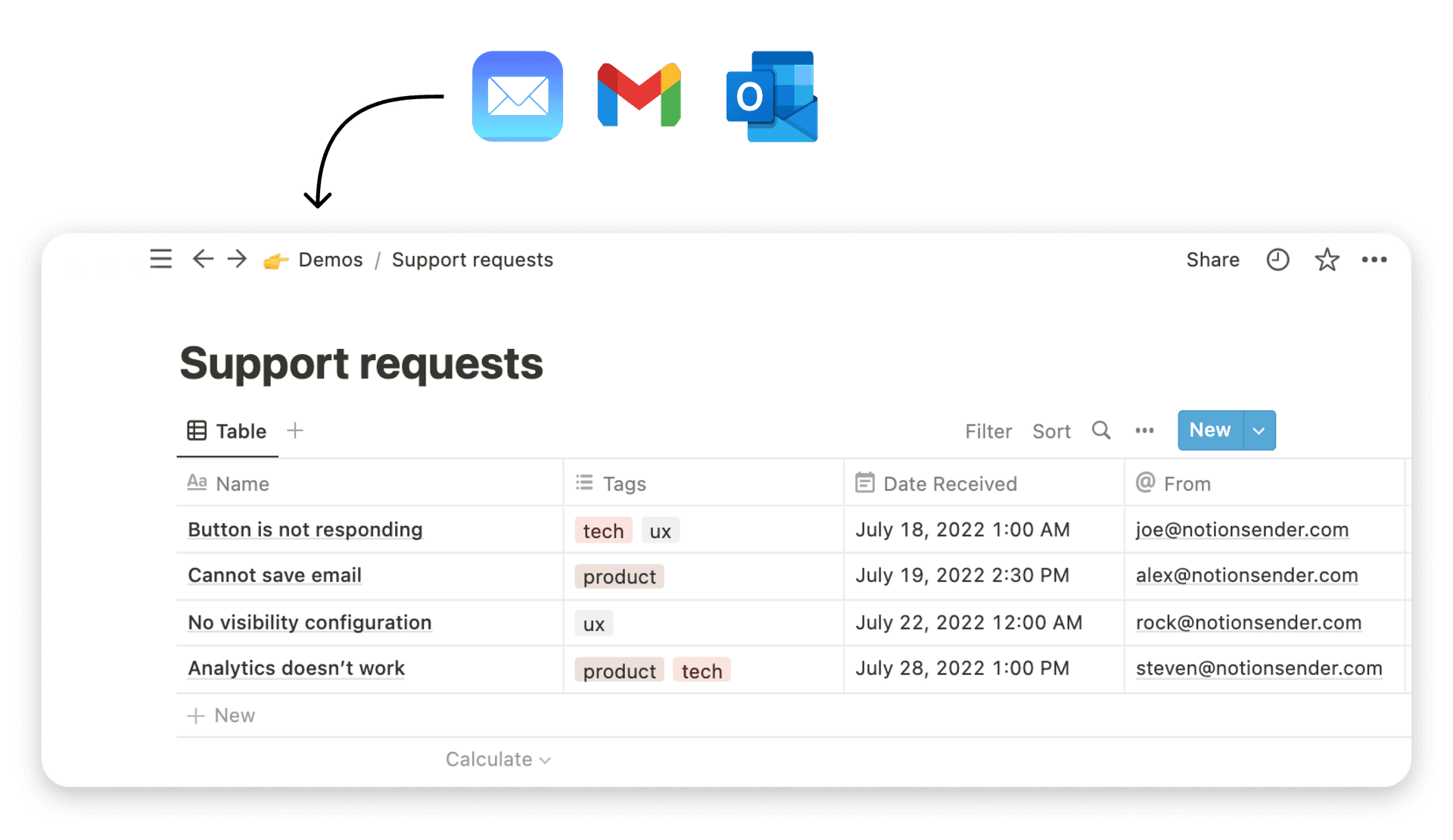
For instance, you can set up templates in Notion for your different post formats. You'll know exactly where the images go, how the headings look, and what call-to-action to use. This lets you stop fussing with formatting and focus on what you do best: creating amazing content. You can even use tools like NotionSender to save inspiring design examples from your email right into a Notion database, building a "swipe file" for your next project.
To see more ways you can use smart tools in your content process, check out our other guides on the NotionSender blog.
The Blueprint for a User-Centric Blog Layout
 Ever walked into a store where everything is exactly where you expect it to be? That’s the feeling we’re aiming for with a user-centric blog layout. The goal is to create an effortless experience that guides your readers, keeping them engaged and on the page longer.
This isn't about throwing flashy graphics at the screen. It's about clarity and purpose. A great layout starts with a solid visual hierarchy that makes your content a breeze to read and navigate.
Visual hierarchy is simply how you arrange elements to show what’s most important. It’s a silent guide for the reader's eye, telling them, "Start here, look at this next, and don't miss this key point." You build this guide with a few simple, powerful tools.
Establishing Clear Visual Hierarchy
The tools for creating hierarchy are probably already familiar to you. The magic is in how you use them to improve your blog pages design.
- Headings and Subheadings: Use H2s for your main sections and H3s for the smaller points within them. This organizes the content for your readers and gives search engines a clear map of your article.
- Bold Text: Make key phrases, numbers, or important takeaways stand out with bolding. Just be sure to use it sparingly so it doesn't lose its punch.
- Blockquotes: Pull out powerful quotes, game-changing stats, or any text that needs to stand on its own. Blockquotes are perfect for giving an idea its own spotlight.
When you use these elements consistently, you create a rhythm that makes your content instantly scannable. Someone can get the gist of your entire post just by glancing at the headings and bolded text, which makes them far more likely to stick around and read the whole thing.
A layout that respects the reader's time is a layout that builds trust. When you make information easy to find and digest, you are signaling that you value their attention, making them more likely to engage with your content.
This structured approach goes beyond just looking good. It's also about making your content accessible to everyone. Following accessible web design standards ensures that all users can understand your content. Good structure is inclusive design.
Using Whitespace to Your Advantage
Whitespace—that empty area around your text and images—is your best friend for readability. Think of it as breathing room for your content.
A page crammed with text feels overwhelming and causes instant fatigue. Adding plenty of whitespace reduces that cognitive load, making your content feel more approachable and way easier to process. This one simple change can do wonders for your bounce rate.
Another key part of readability is line length. For body text, the sweet spot is between 50 and 75 characters per line. If lines are too long, the reader's eye gets lost trying to find the next line. If they're too short, the text feels choppy and broken.
Designing for How People Actually Read Online
Here’s a secret: most people don't read online content word-for-word. They scan. One of the most common scanning behaviors is the F-shaped pattern.
- First, they read horizontally across the top of the page. This is the top bar of the 'F', where your main headline lives.
- Next, they move down a bit and read across again, but not as far. This forms the 'F's' shorter, middle bar. This is often where they catch a subheading or your opening sentence.
- Finally, they scan down the left side of the page in a vertical line. This is why bullet points and short paragraphs work so well—they catch the eye during this final scan.
Once you understand this pattern, you can start placing your most important information—key points, stats, or calls-to-action—directly in the scanner's path. It ensures your core message gets through, even to the skimmers, making your blog pages design that much more effective.
Essential Elements Every Modern Blog Page Needs

Alright, we've got the blueprint for a reader-friendly layout. Now it's time to add the furniture. Think of your blog page like a room: the layout is the floor plan, but these essential elements are the pieces that make it useful and welcoming. Each one has a specific job to do, guiding your reader from the moment they land on the page to your final call-to-action.
A great blog pages design isn't about just throwing these elements onto a page. It’s about how they all work together. When they’re integrated properly, they create a smooth experience that builds trust, gets people to engage, and nudges them to take that next step. Let's walk through the must-have components one by one.
The Compelling Hero and Headline
The very first thing anyone sees is your "hero" section. This is your headline and, usually, a featured image. This space has one critical mission: to instantly convince the reader that they've found what they were looking for.
Your headline is the single most important bit of text on the entire page. It needs to be punchy, clear, and focused on the benefit to the reader. It’s the hook. The image or graphic that goes with it should back up the headline's promise and set the right tone for the article. If your hero section is weak, people will bounce—they'll leave without a second thought if they aren't immediately hooked.
Building Trust with Author Byline and Bio
Here’s a simple truth: people connect with other people, not with faceless brands. A clear author byline, complete with a photo and a short bio, is a huge trust signal. It immediately shows that a real, knowledgeable person wrote the content.
This one simple addition changes an article from just another piece of information online into a conversation with an expert. If you're a freelancer, consultant, or business owner, this is non-negotiable for building your authority and personal brand. It tells the reader who you are and gives them a reason to listen.
An author bio is more than just a name and title; it's a bridge of credibility between you and your reader. It's the digital handshake that says, "I'm a real person with real expertise, and you can trust what I'm about to share."
This is absolutely crucial for establishing E-E-A-T (Experience, Expertise, Authoritativeness, and Trustworthiness), which is a massive factor for both your readers and for search engines like Google.
Intuitive Navigation and Social Proof
Once someone is reading your post, you want to make it dead simple for them to explore your site and share what they've found. Smart navigation elements keep your blog from being a dead end.
- Breadcrumbs: These are the little navigational trails you see at the top of a post (like Home > Blog > Article Title). They show people exactly where they are on your site, which is great for user experience and helps search engines map out your site structure.
- Social Sharing Buttons: Make it a one-click process for readers to share your article. You can place these in a floating sidebar or at the end of the post—just make sure they're visible but not annoying. This is free marketing, plain and simple.
- Categories and Tags: Showing the post's category or a few relevant tags helps readers discover more of your content on topics they're interested in. This is key to keeping them on your site longer.
These might feel like small details, but they are vital parts of a holistic blog pages design that truly puts the reader first.
The Anatomy of a Powerful Call-to-Action
Every blog post you write should have a goal. The call-to-action (CTA) is how you achieve it. A CTA asks the reader to do something specific, whether that's downloading a guide, signing up for your newsletter, or checking out another article. A generic CTA like "Click Here" is a complete waste of an opportunity.
A strong CTA is specific, highlights the value, and stands out visually from the rest of the page. Here's a quick side-by-side comparison:
| CTA Element | Weak Example (Avoid) | Strong Example (Use) |
|---|---|---|
| Verb | Submit | Get |
| Offer | Your Information | Your Free Template |
| Clarity | Vague ("Learn More") | Specific ("Download the Checklist") |
| Design | Blends in with text | Contrasting button color |
For example, instead of a boring "Subscribe," try something like "Join 10,000+ Readers and Get Weekly Tips." This tells people exactly what they're getting and throws in some social proof for good measure. Your CTA is the final, critical step that can turn a passive reader into an active subscriber or customer.
Let's get this straight: even the most beautiful blog pages design is worthless if it doesn't load quickly or looks broken on a phone. Your design choices aren't just about aesthetics; they're directly wired into your search rankings and visitor happiness.
Performance isn’t some technical chore you bolt on at the end. It's part of the design process from the very beginning.
Think of a slow page like a shop with a jammed door. Frustrated customers will just turn around and leave. Google watches this happen, sees the high bounce rate, and figures your page isn't helpful. The result? They're less likely to show it to anyone else. It proves that great design and great SEO are two sides of the same coin.
Demystifying Core Web Vitals
Google uses a set of signals called Core Web Vitals to get a feel for the real-world experience a visitor has on your page. You don’t need to be a developer to grasp the essentials. For your blog content, the big one is Largest Contentful Paint (LCP).
LCP is basically the time it takes for the main attraction—your headline, hero image, or the first block of text—to pop up on the screen. A good LCP is under 2.5 seconds. If the most important part of your article takes longer than that to appear, you're already starting off on the wrong foot and hurting your SEO.
Another one to know is Cumulative Layout Shift (CLS), which is all about visual stability. Ever tried to click a link, only for a pop-up ad to load and push your target down the page? That infuriating jump is a layout shift. A well-designed page loads all its parts smoothly, without elements bouncing around, creating a predictable and calm experience.
A fast, stable page isn't just a technical checkbox; it's a sign of respect for your reader's time and attention. When your blog performs well, you're telling visitors you value them, building trust before they’ve even read a single word.
These signals tell search engines that your site is high-quality, which directly feeds into how well you rank.
Actionable Strategies for a Faster Blog
You don't need to be a performance guru to speed up your blog. Many of the biggest improvements come from simple, design-related tweaks you can make right away.
Here are a few high-impact strategies to get you started:
- Compress Your Images: Giant, unoptimized images are the number one cause of slow-loading pages. Use a free tool to compress them before you upload. You can often slash the file size by over 70% without any noticeable loss in quality.
- Choose the Right Image Format: Whenever you can, use modern formats like WebP. They offer much better compression than old-school JPEGs and PNGs.
- Pick a Quality Web Host: Your web host is the foundation your entire site is built on. A cheap, shared plan might save you a few bucks upfront, but the slow load times will cost you readers and rankings down the road.
- Limit External Scripts: Every social sharing button, analytics tool, or fancy widget you add brings in extra code that can bog things down. Be ruthless and only keep the scripts that are absolutely essential.
Mobile-First Design Is Non-Negotiable
More people now browse the web on their phones than on desktops. Because of this massive shift, Google has adopted mobile-first indexing. This means it primarily looks at the mobile version of your site to decide how to rank it.
This makes responsive design an absolute must. A responsive blog pages design automatically re-arranges itself to fit any screen, from a small smartphone to a giant monitor.
If visitors have to pinch and zoom just to read your text on a phone, you're providing a clunky experience, and your search rankings will take a hit. The goal is a seamless, intuitive experience, no matter how someone finds your content.
Streamlining Your Content Design Workflow
<iframe width="100%" style="aspect-ratio: 16 / 9;" src="https://www.youtube.com/embed/cHDJv6eR5j0" frameborder="0" allow="autoplay; encrypted-media" allowfullscreen></iframe>
A great blog pages design isn't magic—it comes from a smart, repeatable process. If your content creation feels like a total mess, you’re not alone. Without a system, it's easy to end up with inconsistent layouts and a brand experience that feels all over the place. The key is to get your creative process organized.
Believe it or not, this starts way before you open your website editor. A truly smooth workflow ties planning, writing, and designing together from the very beginning. Imagine starting your next blog post idea inside a central hub like Notion, where you can map out the structure, drop in your research, and start drafting.
When you start this way, every piece of content is built on a solid foundation. You're not just throwing words on a page; you're building an article that already has its future design in mind.
Building Your Design Inspiration Library
We all want our designs to feel fresh, but consistency is just as important. So, where do you find that constant stream of new ideas? You build a "Design Swipe File"—your own personal library of awesome design examples you can pull from anytime.
This is where your everyday tools become part of your design process. For example, when you find a blog with a killer layout or a clever call-to-action, you need a way to grab it fast. With a tool like NotionSender, you can just forward an email or use a special address to save a link or screenshot right into a "Swipe File" database in Notion.
This simple trick turns your inbox into a pipeline for great ideas. Over time, you’ll have a huge collection of inspiration to draw from, so you never have to start from a blank slate again. It's a great way to get the most out of Notion for your content workflow.
A well-curated swipe file is like a cheat sheet for great design. It removes the guesswork and provides a concrete starting point, helping you maintain a high standard of quality across all your content.
For project managers and marketers, this system is a lifesaver. It helps maintain brand standards while still pumping out new content, turning a scattered creative process into a well-oiled machine.
The Three-Step Optimization Flow
To make sure every single post is set up for success, build a final optimization check right into your workflow. This simple flow covers the last three checks for every post: image optimization, page speed, and mobile responsiveness.

This is a great reminder that a post isn't really "done" until it's optimized for the user on every front.
From Draft to Published Post
Your new, repeatable workflow might look something like this:
- Brainstorm & Outline in Notion: Start with a clear structure in a dedicated database. Map out your H2s, H3s, key points, and the main goal of the post.
- Draft Content: Write the full text right there in your Notion page, focusing on delivering clear value.
- Gather & Optimize Visuals: Find or create your images, compress them for speed, and add them to the draft.
- Email for Review: Use a tool like NotionSender to send the draft to your team for feedback, directly from Notion. This keeps the whole conversation connected to the document.
- Final Design & Publishing: Move the approved content into your CMS, apply your design template, and run through a final pre-publish checklist (SEO, links, mobile view).
By systemizing your blog pages design and content creation, you guarantee a higher level of quality and consistency every time. This structure gives you the freedom to focus on the creative stuff, not the chaotic admin tasks that slow you down.
Common Questions About Blog Page Design
Once you start digging into blog design, a lot of practical questions come up. It's one thing to talk about theory, but another to make smart decisions on the fly. Let's walk through some of the most common ones I hear.
How Can I Improve My Blog Page Design on a Limited Budget?
You don't need a massive budget to get a professional look. The trick is to nail the fundamentals that have the biggest impact for the lowest cost.
Start with a clean, minimalist theme from a trusted marketplace. Make readability your top priority by picking a simple font like Lato or Open Sans and making sure your text has high contrast against the background. Then, embrace whitespace. Just adding more "breathing room" around your text and images instantly makes everything feel more polished and less cluttered.
You can find plenty of free tools for creating visuals and checking your site’s performance. Focusing on a clean layout and a great reading experience will give you 80% of the results without spending much at all.
What Is the Most Important Design Element for SEO?
If you have to pick just one, it's mobile responsiveness. There's no contest. Google now uses mobile-first indexing, meaning it judges and ranks your site primarily based on how it looks and works on a smartphone.
If your blog is a mess to read on a phone, your search rankings will take a direct hit. Page speed is a very close second. A slow-loading site frustrates users and sends them clicking away, which tells search engines that your page offers a poor experience. These two technical factors are huge for visibility.
Should I Use a Template or Design Each Post Individually?
For 99% of blogs, using a template is the only way to go. It’s all about efficiency and brand consistency. A template gives every article a familiar structure, which builds trust with your readers and makes your entire blog feel more cohesive.
A template acts as a quality control system for your design. It guarantees a consistent brand experience, saves you countless hours, and frees you up to focus on what truly matters—creating valuable content.
Trying to design every single post from scratch just doesn't scale, and you'll end up with a jumbled, inconsistent look. A much better workflow is creating a handful of flexible templates for different types of posts, like listicles, guides, or case studies. For example, you could learn how to create and send email from Notion to get feedback from your team while building out these templates.
How Often Should I Update My Blog Design?
You really only need a complete, top-to-bottom redesign every 3-5 years, or if you go through a major rebrand. It's much better to focus on small, continuous improvements rather than massive, disruptive changes.
On a regular basis, try testing new call-to-action buttons, experimenting with different typography, or optimizing your images to load faster. This iterative process is less jarring for your readers and usually leads to better, more sustainable results over time.
Ready to transform your content workflow from chaotic to streamlined? With NotionSender, you can manage email-driven content, save design inspiration, and collaborate with your team—all from your Notion workspace. Turn your content management into an organized, efficient powerhouse. Visit https://www.notionsender.com to learn more.