Email Performance Metrics: The 2026 Guide to Growth

You're probably looking at a messy set of email stats right now. One campaign had decent opens but weak clicks. Another generated replies but almost no sales. A third looked fine on the surface, yet your list quality slipped and nobody noticed until results flattened.
That's the trap with email performance metrics. Many marketers track them, but very few connect them into a working system. They check open rates after a send, glance at clicks, and move on. What they need is a dashboard that shows what happened, why it happened, and what to do next.
For a small business, freelancer, or lean marketing team, that dashboard doesn't need to live in a bloated analytics stack. It can live where your work already happens. If your campaigns, clients, and projects already run in Notion, your email performance metrics should live there too. That turns email from a disconnected channel into an operational system you can manage.
The Four Foundational Email Engagement Metrics
Email performance metrics only become useful when you stop treating them as isolated definitions. Each one reflects a different layer of audience intent. One tells you whether the message earned attention. Another tells you whether the content matched that promise. Another tells you whether the campaign moved someone to act.
What each core metric really means
Open rate measures how many delivered emails were opened. The formula is:
Open Rate = (Emails Opened / Emails Delivered) × 100
According to Mailchimp's December 2023 data, the average open rate across industries was 34.23%, which gives you a practical benchmark for evaluating campaign performance in Campaign Monitor's overview of essential email marketing metrics. Open rate is mainly a read on subject line strength, sender recognition, and timing.
Click-through rate, or CTR, measures how many recipients clicked a link in your email. The practical formula commonly used is:
CTR = (Unique Clicks / Emails Delivered) × 100
CTR tells you whether the body of the email did its job. Strong opens and weak clicks usually mean the subject line worked, but the email content or offer didn't carry enough weight.
Conversion rate measures how many recipients completed the action you wanted, such as booking a call, making a purchase, or filling out a form.
Conversion Rate = (Conversions / Emails Delivered) × 100
Intent turns into business value here. A campaign can have modest opens and still perform well if the right people convert.
Unsubscribe rate measures how many delivered emails led people to leave your list.
Unsubscribe Rate = (Unsubscribes / Emails Delivered) × 100
This metric often gets ignored until it spikes. That's a mistake. It tells you whether the message was irrelevant, too frequent, or poorly matched to the audience.
Core Email Engagement Metrics at a Glance
| Metric | Calculation Formula | What It Tells You |
|---|---|---|
| Open Rate | (Emails Opened / Emails Delivered) × 100 | Whether your subject line, sender name, and timing earned attention |
| Click-Through Rate | (Unique Clicks / Emails Delivered) × 100 | Whether the email content and call to action felt relevant |
| Conversion Rate | (Conversions / Emails Delivered) × 100 | Whether the campaign produced a real business action |
| Unsubscribe Rate | (Unsubscribes / Emails Delivered) × 100 | Whether the message pushed people away |
There's one important caveat with opens. They're useful, but they aren't perfect. If you want a grounded explanation of that trade-off, the Robotomail perspective on email reliability is worth reading because it explains why open tracking should guide decisions, not dictate them.
Practical rule: Treat opens as attention, clicks as interest, conversions as intent, and unsubscribes as friction.
If your open rate is lagging, focus first on subject lines, list quality, and send timing. If you need ideas for that specific problem, these email marketing tricks to increase your open rates are a useful next step.
Understanding Email Deliverability and List Health
You can write a sharp subject line, a clear offer, and a strong call to action, then still lose the campaign before anyone sees it. That happens when deliverability slips. Email performance metrics start with inbox placement, not engagement.
Compare it to physical mail. If the postal service never delivers the envelope, the copy inside doesn't matter. Email works the same way. Your engagement metrics only mean something after the message reaches the inbox.

The metrics that protect your sending channel
Deliverability rate measures how many sent emails were successfully delivered.
Deliverability Rate = (Emails Delivered / Emails Sent) × 100
Successful email programs typically achieve 95-99% delivery rates, according to Salesforce's summary of top email KPIs. When delivery falls, every other metric gets distorted.
Bounce rate tracks emails that failed to reach recipients. Hard bounces usually come from invalid addresses. Soft bounces usually come from temporary issues like a full inbox or provider-side throttling. Well-maintained lists typically sit around 2-5% bounce rate, also noted in the same Salesforce reference.
The cost of ignoring this is direct. A sender with a 2% bounce rate on a 10,000-person list loses 200 potential customer touchpoints per campaign, as Salesforce explains in that same KPI guide. That's not a vanity issue. It's lost reach.
Spam complaints tell mailbox providers that recipients don't want your messages. Once that signal starts accumulating, inbox placement gets harder even for good campaigns.
What healthy list management looks like
Strong list health comes from routine discipline, not occasional cleanup. The teams that maintain stable performance usually do these things consistently:
- Remove bad addresses quickly: Don't keep retrying clearly invalid contacts.
- Watch soft bounce patterns: A temporary issue can become a recurring deliverability problem if it's ignored.
- Track spam complaints by campaign type: Promotional sends often create different risk than lifecycle or transactional emails.
- Monitor list growth alongside list decay: A growing list means little if the wrong subscribers are replacing the right ones.
Deliverability is the ticket to entry. If inbox placement weakens, engagement metrics stop telling the truth.
List health should also live close to campaign execution. If your sending workflow runs in Notion, your bounce, complaint, and suppression logic should sit there too, not in a separate spreadsheet someone checks once a month. For a practical companion on this operational side, these expert tips for successful emails fit well with a deliverability-first workflow.
Linking Email Metrics to Revenue and Growth
Most reporting breaks at the exact point leadership starts paying attention. Teams can explain opens, clicks, and unsubscribes, but they can't clearly show how those metrics influence revenue. That's where email performance metrics need to graduate from campaign reporting to business reporting.
The cleanest way to think about it is as a ladder. Deliverability supports engagement. Engagement supports conversion. Conversion supports revenue. If one rung weakens, the numbers above it usually weaken too.
From campaign activity to commercial value
A useful revenue metric is revenue per email, often called RPE.
RPE = Revenue Attributed to the Campaign / Total Emails Sent
This metric forces clarity. A campaign with strong clicks but weak RPE may be attracting curiosity without producing buying action. A campaign with modest click volume and strong RPE may be targeting the right audience with the right offer.
Another useful view is basic campaign ROI.
ROI = (Revenue Attributed to Email - Total Campaign Cost) / Total Campaign Cost
You don't need a complex finance model to use this well. What matters is consistency. Use the same attribution logic each time so you can compare campaigns accurately.
Customer lifetime value also belongs in the conversation, especially for service businesses and recurring-revenue companies. Email often doesn't create value in a single send. It compounds through onboarding, retention, reminders, education, and reactivation.
The operational signals that affect revenue first
Bloomreach notes that teams should monitor daily bounce rates and open-rate variance by provider, because spikes in soft bounces above 2-5% weekly can signal throttling by providers like Gmail. The same analysis says campaigns with delivery above 98% achieve 15-25% higher CTOR, which makes a strong case for treating inbox placement as a revenue lever, not just a technical metric, in Bloomreach's deep dive on email analytics.
That matters because revenue problems rarely start as revenue problems. They usually begin lower in the system.
- Falling delivery reduces total opportunity.
- Stable opens but weaker clicks point to a message-offer mismatch.
- Good clicks but poor conversion usually means the landing page, sales process, or CTA path is broken.
- Weak repeat purchase behavior suggests your email program is failing retention, not acquisition.
The highest-value dashboard isn't the one with the most metrics. It's the one that shows which lower-level signal is blocking revenue.
If you run B2B email, this blueprint for B2B email success is a useful complement because it frames messaging and pipeline impact together, not as separate reporting tracks.
Using Segmentation to Uncover Deeper Insights
Average metrics feel comforting because they give you one number to report. They're also one of the fastest ways to misread performance.
A list-wide open rate can hide a serious problem. New subscribers may be highly engaged while older leads are fading. Recent buyers may click frequently while non-buyers ignore every promotion. If you only look at the average, you flatten all of that into one tidy number and lose the operational truth.
Why averages mislead small teams
Small businesses often assume segmentation is something larger companies do once they have extra time, bigger tools, and dedicated analysts. In practice, the opposite is true. Smaller teams have less margin for waste, which means they need sharper audience distinctions sooner.
Salesforce notes that small businesses see 2-3x higher revenue per email when segmenting audiences, and recommends tracking new subscribers in the first 30 days, active buyers in the last 90 days, and at-risk users separately because generic benchmarks often mislead in Salesforce's email benchmark guidance.
That's the fundamental shift. Stop asking, “What's my open rate?” Ask, “What's my open rate for people who just joined, people who recently bought, and people drifting away?”
Three segments that reveal what to fix
New subscribers need early validation. Watch opens, clicks, and first conversion behavior. If they open but don't click, your welcome emails may be clear but not compelling. If they don't open at all, your signup promise and first-touch subject lines may be misaligned.
Active buyers need relevance and timing. They already know your brand. Watch repeat clicks, offer engagement, and downstream conversion patterns. If they click but don't buy, the issue is often offer fatigue or weak post-click experience.
At-risk users need a different goal entirely. You are not trying to maximize clicks at all costs. You're trying to detect disengagement early and earn another interaction before they lapse completely.
A simple segmented review often surfaces things a blended report hides:
- New subscribers underperforming: Check signup source, onboarding sequence, and expectation-setting.
- Active buyers cooling off: Review message cadence, product mix, and whether every email asks for a sale.
- At-risk users ignoring everything: Reduce frequency, change the angle, or try a plain-language reactivation sequence.
Segment performance tells you where the relationship is breaking. The overall average only tells you that something broke.
The practical payoff is sharper decisions. You write better campaigns when you know which audience state you're speaking to. You also avoid the common mistake of optimizing for a healthy segment while another segment erodes.
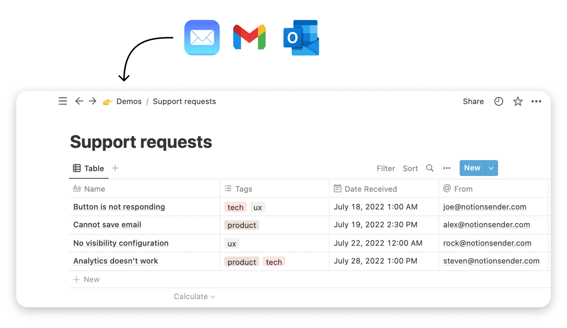
How to Track Email Metrics in Notion with NotionSender
Organizations often don't fail at email measurement because they lack metrics. They fail because the data is scattered across an ESP dashboard, a CRM, a spreadsheet, and someone's memory. That setup makes trend analysis slow and troubleshooting reactive.
A central dashboard in Notion solves that operational problem. It gives you one place to track sends, segments, engagement, deliverability signals, and business outcomes. That matters even more now because post-2025 ISP filter updates have increased the need for diagnostic dashboards, and spam complaints for non-segmented sends are up 15%, which Litmus highlights in its discussion of the email metrics marketers measure and the ones they should track in Litmus's dashboard-focused email metrics article.

Build the database first
Create a Notion database where each row represents one email campaign or automated message. Keep the schema practical. You want enough fields to diagnose performance without turning maintenance into a second job.
Useful properties include:
- Campaign name: A clear label tied to the send or workflow.
- Email type: Newsletter, welcome email, follow-up, reminder, win-back, invoice, or promo.
- Audience segment: New subscriber, active buyer, at-risk, client, lead source, or custom segment.
- Emails sent, delivered, opened, clicked: Raw counts matter because formulas depend on them.
- Unsubscribes, bounces, spam complaints: These are your health signals.
- Conversions and attributed revenue: Add these manually or sync them from your existing process.
- Send date and owner: Useful for trend views and accountability.
Add formulas that answer real questions
Once the raw properties exist, create formula fields for the rates you'll use every week:
- Open rate
- CTR
- Conversion rate
- Unsubscribe rate
- Bounce rate
- Revenue per email
The point isn't to recreate a full BI platform. The point is to make the main questions visible in the same place where campaigns are planned and reviewed.
Use views for diagnosis, not just organization
One database can support several useful views:
- Executive view: Send date, campaign name, segment, revenue, and key rates.
- Deliverability view: Delivered, bounced, spam complaints, unsubscribes.
- Segment view: Group by audience segment to compare behavior cleanly.
- Automation view: Filter for recurring emails only so silent degradation becomes visible.
NotionSender naturally fits. It sends and receives emails inside Notion, supports automation and scheduling, and can track engagement data such as opens and clicks against database entries, which makes the workspace usable as an email operations dashboard rather than just a planning tool. If you need implementation detail, the NotionSender API documentation shows how to connect structured email activity with your Notion setup.
Central dashboards work because they shorten the distance between a bad signal and the fix. You spot the issue where the work already lives.
A Practical Guide to Troubleshooting and Optimization
The most useful email performance metrics are diagnostic. They tell you what to inspect next. When a number drops, don't jump straight to rewriting copy. Start with the symptom, then trace the likely breakpoints in order.
If opens are weak
Check the top of the funnel first.
- Review sender recognition: If recipients don't recognize the sender, they won't open.
- Audit subject line intent: Curiosity alone isn't enough. The subject has to match the audience's immediate interest.
- Look at list quality: Weak opens often come from stale or poorly sourced contacts.
- Compare by segment: If new subscribers open and older leads don't, the issue isn't universal.
If opens are fine but clicks are poor
This usually means the subject line made a promise the body didn't fulfill.
- Tighten the first screen: Readers should understand the point before they scroll.
- Reduce competing links: Too many options can lower action.
- Strengthen the CTA: Make the next step specific, visible, and easy to understand.
- Check mobile rendering: A strong message can still fail if the button is buried or awkward on a phone.
If clicks happen but conversions don't
The email may not be the actual problem.
- Inspect the landing page: Message match matters. The page should continue the same promise.
- Simplify the path: Too many form fields or steps can kill momentum.
- Check offer fit by segment: A generic offer often underperforms even when click intent is real.
- Review timing: Some campaigns need a shorter path to action than others.
If unsubscribes, bounces, or complaints rise
Treat this as a system warning, not an isolated blip.
- Reduce frequency for cold segments: Not every audience should hear from you at the same pace.
- Suppress bad contacts faster: Repeatedly mailing low-quality addresses hurts everyone else.
- Separate automation from broadcasts: One neglected workflow can drag down overall health.
- Track trends, not just one send: Persistent drift matters more than a single rough campaign.
The discipline that works is simple. Don't chase every metric every day. Pick the signal that moved, follow the likely cause, fix one layer at a time, and document what changed in your dashboard.
If you want your email performance metrics in the same place as your campaigns, client work, and operating data, NotionSender gives you a practical way to run that system inside Notion. It helps centralize email activity, automate sends, and keep performance data attached to the records your team already uses, which makes ongoing analysis far easier than jumping between disconnected tools.