Mastering the Focal Point in Design to Capture Attention

Ever walked into a room where everything is shouting for your attention at once? It’s chaotic, confusing, and you have no idea where to look first. That’s exactly what a design without a focal point feels like to a user.
A design's focal point is its main character—the one thing you want your audience to see first and remember most. It cuts through the noise and instantly tells people, "Start here."
What Is a Focal Point in Design and Why It Matters
Without a clear visual starting line, every element on the page competes for attention, and ultimately, nothing wins. Your key message gets lost in the shuffle, and that all-important "Buy Now" button might as well be invisible. This is a huge problem for anyone trying to get something done, from a project manager organizing a Notion dashboard to a small business owner designing a marketing email.
A strong focal point creates an instant visual hierarchy. It’s the friendly guide that takes your viewer by the hand, leading them from the most important piece of information to the next. This could be a bold headline, a vibrant call-to-action, or a really compelling image. It gives the entire layout a clear purpose.
The Impact of a Clear Visual Guide
When you intentionally create a focal point, you're making a strategic decision about what matters most. It’s the difference between a visitor bouncing from your website in confusion and clicking to make a purchase. For a team, it's the difference between a messy, ignored project page and a clear, actionable hub that everyone actually uses.
A design's primary job is to communicate. A focal point ensures your most important message is delivered instantly, preventing confusion and guiding the user toward a specific outcome. It turns a passive viewing experience into an active, directed journey.
Mastering the art of the focal point isn't just a "nice-to-have" skill for artists; it's a fundamental requirement for effective communication in any role.
Just look at the tangible difference a single point of focus can make. The table below breaks down how a clear focal point directly boosts the performance of any design you create.
How a Clear Focal Point Impacts Design Performance
| Metric | Design With a Clear Focal Point | Design Without a Clear Focal Point |
|---|---|---|
| User Attention | Immediately drawn to the main message or call-to-action. | Scattered and unfocused; users scan randomly. |
| Clarity of Message | The primary message is understood in seconds. | Key information is easily missed or misinterpreted. |
| Conversion Rate | Significantly higher, as users are guided to the desired action. | Lower, as the path to conversion is unclear. |
| User Experience | Intuitive and stress-free; users feel guided and confident. | Confusing and overwhelming; can lead to user frustration. |
As you can see, the benefits are clear. A focused design doesn't just look better—it works better, helping you achieve your goals more effectively.
The 6 Core Principles for Creating Powerful Focal Points
Making a design element pop isn't just a matter of luck. It all comes down to a handful of core design principles. Think of them as your secret weapons for guiding your audience's attention. Once you get the hang of these, you can take any layout from cluttered and confusing to crystal clear.
The goal is to make sure your most important message gets seen first. These principles build a visual road map, telling the user’s eye exactly where to look. This isn't just about making things look good; it's about turning your design into a tool that actually works.
Before we dive into the principles themselves, look at this flow. It shows how everything should work together to support your main message.

As you can see, a strong focal point always starts with a clear message. Your design choices then amplify that message and create a path for the user.
Now, let's break down the 6 principles that make it all happen.
Contrast and Color
Contrast is probably the fastest way to create a focal point. When one thing looks dramatically different from everything around it, our eyes just can’t help but notice. Think about a single red "Buy Now" button on a simple, black-and-white landing page. You literally can't miss it. That’s contrast doing its job.
Color is your best friend when it comes to creating contrast. A single, bright, saturated color will always jump out from a page of muted or neutral tones. It's a powerful psychological tool—studies even show that using a signature color can boost brand recognition by 80%. You can use that same magnetic pull to make your call-to-action the star of the show.
Scale and Hierarchy
Another incredibly effective trick is playing with scale. If you make one element physically larger than everything else, you’re sending a clear signal: "This is important!" A huge, bold headline doesn't just deliver words; its size immediately establishes it as the top dog on the page.
This is the foundation of visual hierarchy—the art of arranging elements by their order of importance. Your focal point should always sit at the very top of that pyramid. By using different sizes, colors, and positions, you create a trail for the eye to follow, starting with your main point and flowing down to the secondary details.
A design without hierarchy is like a meeting where everyone talks at once. By establishing a clear focal point, you give one voice the microphone, ensuring the most critical message is heard loud and clear.
Balance and Alignment
Finally, let's talk about the unsung heroes: balance and alignment. These principles create the sturdy structure that holds your whole design together and makes your focal point feel intentional.
Balance is all about how you distribute visual weight. You can create a really dynamic feel with asymmetrical balance—imagine a large, heavy focal point on the left side of a page, perfectly offset by a few smaller, lighter elements on the right.
Alignment is what connects everything, creating clean, invisible lines that our eyes naturally follow. When your focal point is aligned with other key items, it guides the user smoothly across the page. This keeps the design from feeling random or chaotic and reinforces the exact path you want people to take.
Boost Email Engagement with Strategic Focal Points
<iframe width="100%" style="aspect-ratio: 16 / 9;" src="https://www.youtube.com/embed/oVHdZI_iQfY" frameborder="0" allow="autoplay; encrypted-media" allowfullscreen></iframe>
Your emails are fighting for attention in a seriously crowded inbox. A strong focal point in design is how you cut through that noise and win.
It's the one element that stands out, immediately telling your reader what the email is about and exactly what you want them to do next. This isn't just about making things look nice; it's about getting people to act.
By creating a clear visual path, you guide subscribers straight to the most important part of your message—whether that's a new product, an important announcement, or a big, clickable call-to-action (CTA) button.
Turning Emails into Conversion Engines
Think of your email layout like a map. Your focal point is the big "You Are Here" marker that shows the direct path to the treasure. Without it, your subscribers are just wandering, and they’ll probably hit delete.
A well-placed hero image, a brightly colored "Claim Your Discount" button, or a bold headline announcing a sale can all work as powerful focal points. They use contrast, scale, and color to draw the eye and create a sense of importance. For anyone using tools like NotionSender, this is a simple way to build campaigns that actually convert.
An email with a clear focal point doesn't just inform; it persuades. It transforms a simple message into a direct, compelling request that is easy for the user to understand and act upon.
The data proves this out. In email marketing, a strong focal point can have a huge impact on performance. While a good email conversion rate is often between 2% and 5%, that number can jump significantly when the design guides the eye.
Some reports show conversion rates hitting 17% to 30% in key industries, all because the email made the main objective impossible to miss.
Practical Steps for NotionSender Users
If you're managing campaigns with NotionSender, applying these principles is straightforward. When you build an email template, just identify the single most important action you want someone to take.
- Make Your CTA the Star: Design your "Book a Demo" or "Download Now" button with a contrasting color that pops against the background. It should be the first thing people notice.
- Use Compelling Imagery: Start with a high-quality image that tells a story and relates directly to your offer. This creates an immediate visual anchor for the entire email.
- Highlight Key Information: Are you offering 25% off? Make that text bigger, bolder, or a different color. This number becomes a focal point that grabs attention instantly.
When you build your emails around a single, powerful focal point, you create clarity and drive results. To learn more about how design choices influence subscriber behavior, these Email Marketing Best Practices offer some great strategies.
You can also read our guide on how to increase your open rates with these 10 email marketing tricks.
Design Your Marketing Assets for Maximum Action
Every single marketing piece you put out there—from a quick social post to a detailed landing page—needs to have one specific job. A powerful focal point in design is what makes sure it gets that job done, guiding your audience to take that one, single most important action (SMA).
What does that really mean? It means you're building the entire asset around a single goal. Maybe it's a click, a sign-up, or a purchase. If you don't zero in on that one thing, your message gets muddy, and you can just watch your conversion potential dry up. Your goal is to make the action you want them to take the undeniable hero of the page.

From Visuals to Conversions
Let's say you're running a flash sale. Your Instagram post shouldn't just mention the sale; it needs to practically shout "Shop Now!" That "Shop Now" button has to be the focal point, maybe by using a color that pops, making it bigger, or placing it right in the center. Everything else on the screen, from the product image to the text, is just there to support that one action.
It's the same story on a landing page for a webinar. The sign-up form is your SMA. Your headline, bullet points, and testimonials are all working together, leading the visitor's eye straight to that form. The submit button is the visual exclamation point at the end of the sentence. To really nail this, it's worth exploring different Website Conversion Rate Optimization Techniques, where you'll see how these strategic focal points are used to steer user behavior.
This is even more crucial when it comes to email. A strong focal point can make or break your campaign. Just look at the numbers. While MailerLite's 2026 data shows an average email click-through rate of 2.09%, the click-to-open rates are where focal design really shines. The median is 6.81%, but some industries see highs of 14.82%. That gap shows what happens when a single, bold element grabs a reader's attention and prompts a click.
A Practical Example: A Bakery’s New Pastry Launch
Let's walk through how this works in the real world. Imagine a local bakery is launching a new seasonal pastry. Here’s how they can use a focal point across their marketing.
- Social Media Ad: The absolute focal point is a gorgeous, high-resolution photo of the pastry. The text is short and sweet, with a brightly colored button that says, “Order Now for Pickup.” No confusion.
- Landing Page: The hero section uses that same drool-worthy photo. The headline screams, “Taste the Season: Our New Apple Crumble Croissant is Here.” All the copy on the page guides the user down to a simple order form, which is clearly the main event.
- Confirmation Email: After the order is placed, the email's focal point shifts. Now, it's all about the pickup info: “Your Order is Confirmed! Pick Up Today After 2 PM.” This clear focus makes for a great customer experience.
When you align every design choice with a single conversion goal, you're creating a seamless and convincing path for your customer. You can learn more about this in our guide on how to send the perfect email to get the response you want.
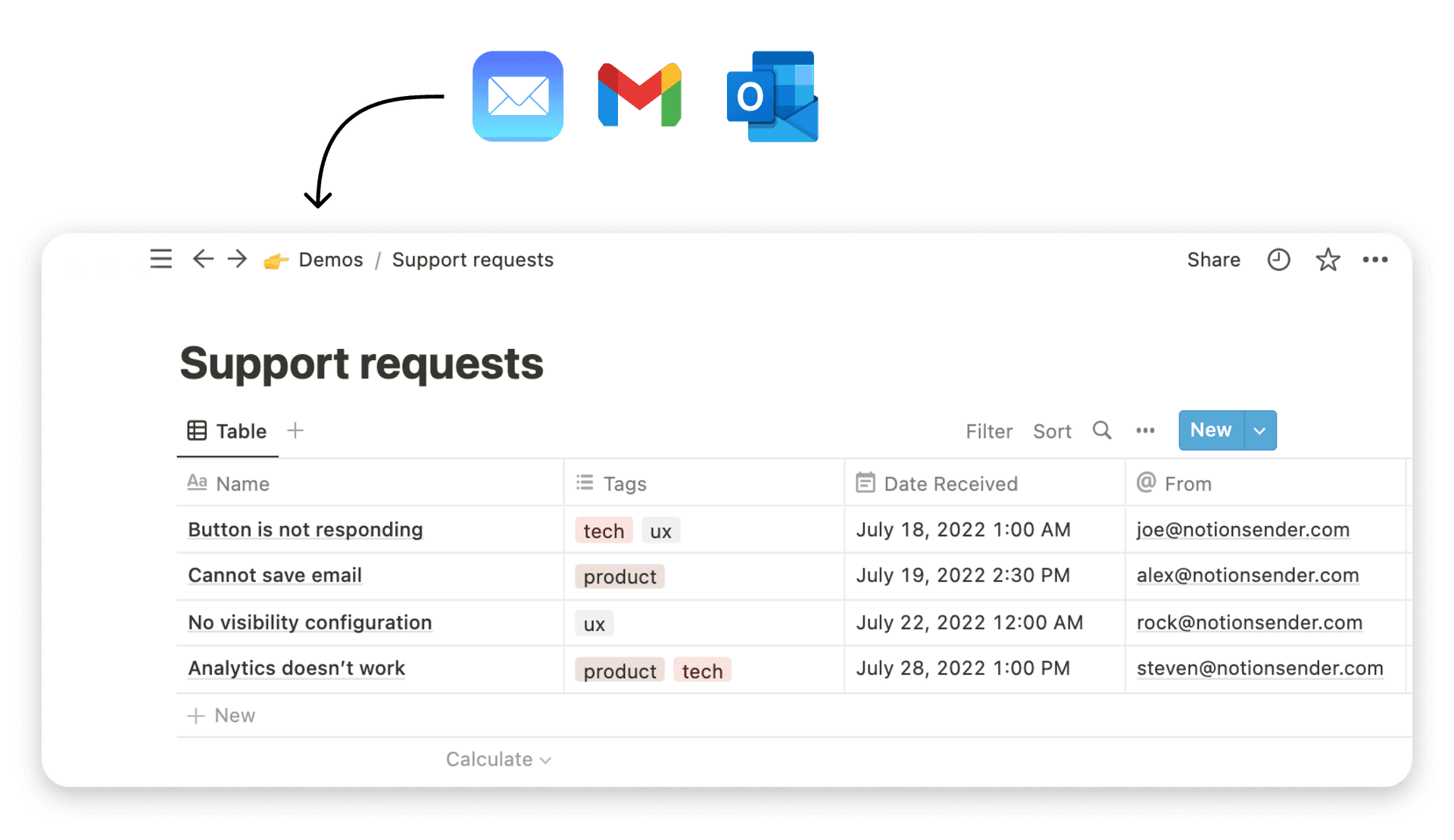
Organize Your Notion Workspace with Clear Focal Points
Design isn't just for making things pretty—it's for making things work. If your Notion workspace feels like a desk buried under piles of paper, you know the frustration. The info is in there somewhere, but finding it is a frantic scavenger hunt that kills your focus.
By borrowing a core idea from design, the focal point, you can turn that digital chaos into a clean, scannable dashboard that actually helps you get things done.
Think of your Notion page as a room. Without a clear centerpiece, everything shouts for your attention at once. Your "Urgent Tasks" list ends up getting lost next to random notes from last quarter and links to old projects. A good focal point acts as a visual signpost, guiding you and your team straight to what matters most right now.

Making Your Priorities Impossible to Miss
Creating a focal point in Notion doesn't require a design degree. It’s about using the tools you already have—headers, colors, and blocks—to create a clear visual hierarchy. You’re simply making smart choices to tell your eyes where to look first.
When a workspace is well-designed, everyone on the team stays aligned. It just makes it easier to see project statuses, check key metrics, or find daily priorities at a glance without having to think too hard.
In a tool like Notion, the focal point isn't about looks; it's about function. It's the one thing on the page that instantly answers the question, "What's the most important thing I need to do or know right now?"
This principle is powerful everywhere. For instance, a focal point in design is what turns a cluttered marketing email into a click-worthy message. While a physical letter in direct mail gets an 80-90% open rate just by showing up, smart email design has to work harder to capture attention. But when it does, by using a strong visual focus, email conversions can jump way past the 2.8% B2C average. You can see more on how physical presence impacts engagement in these direct mail statistics.
A Mini-Template for a Project Dashboard
Ready to build a more focused workspace? Here’s a super simple setup to create a clear focal point for any project dashboard.
- Start with a Huge Header (H1): The first thing on your page should be a big, bold H1 header for your main "To-Do List" or "Key Project Metrics." Its size immediately tells everyone it's the most important section.
- Use a Callout Block: Put your most critical tasks or numbers inside a callout block. Just giving it a subtle background color and an icon makes it pop right off the page. It's impossible to ignore.
- Create a Gallery for Projects: For your active projects, switch to a gallery view database. Add some simple, compelling cover images. The visuals will naturally pull the eye, creating a strong secondary focal area.
With just these simple moves, you can wrangle the clutter and build a Notion workspace that works for you, not against you. For even more ideas, check out these 10 tips to help you get the most out of Notion.
Your Checklist for Creating an Effective Focal Point
Alright, we’ve covered the principles behind creating a solid focal point. But how do you apply this to your day-to-day work without getting lost in the theory?
Think of this checklist as your pre-flight check before you launch any new design. It’s a simple set of questions to keep you honest and ensure you're always guiding your audience's attention with purpose.
Foundational Questions
Before you even think about colors or fonts, you need to get your strategy straight. These first two questions are non-negotiable.
- One Clear Goal: Have I decided on the single most important thing I want someone to see or do with this design?
- Message First: Does my chosen focal point directly support the primary message I need to get across?
Design and Execution Questions
Once you know your "what" and "why," you can move on to the "how." This is where you double-check the visual tactics you're using to make your focal point impossible to ignore.
- Contrast: Is there a strong enough difference in color, size, or even shape to make my focal point pop right off the page?
- Scale and Hierarchy: Is the main element obviously larger or more visually dominant than everything else around it?
- Clear Path: Is the journey to the focal point clean and free of clutter? Or are there other elements fighting for attention along the way?
- Supporting Cast: Do all the other elements on the page act like a good supporting cast, directing attention to the star of the show instead of stealing the spotlight?
Remember, a powerful focal point is never an accident. It’s a deliberate choice that brings instant clarity and purpose to your work. You're making sure your audience sees exactly what you want them to, right away.
Running through these questions takes just a minute, but it can be the difference between a design that just looks nice and one that actually gets results.
Frequently Asked Questions About Focal Point Design
Okay, so we've covered the theory. But how does this actually work when you're staring at a blank page? Let's dig into a couple of questions that pop up all the time when you start creating your own focal points.
Can a Design Have More Than One Focal Point?
Technically, yes—but you have to be careful. While having one clear focal point is the safest bet, a more complex design can sometimes have a primary and a secondary one. The trick is making sure there's an obvious pecking order.
Think about a landing page. The big, bold headline is your main focal point; it’s what grabs someone’s attention immediately. A colorful "Sign Up Now" button can then act as a strong secondary point, showing them exactly what to do next.
Your main focal point should be the undeniable star of the show. Everything else is just a supporting actor. If two elements are fighting for the top spot, your design will feel cluttered and confusing, which defeats the whole purpose.
How Do I Create a Focal Point with Limited Skills?
Good news: you don't need to be a design wizard or have fancy software to make this work. Often, the simplest tricks are the most effective. If you’re just starting out, stick to the basics.
- Use Bold Text: Make your most important headline or a key number noticeably bolder than everything around it. It’s an instant attention-grabber.
- Leverage White Space: Don't be afraid of empty space. Just leaving a bit of a buffer around an element will naturally pull the eye right to it.
- Play with Scale: Make one thing bigger. An image, a quote, or a call-to-action button that’s significantly larger than the rest of the content is impossible to ignore.
These small tweaks create a clear visual priority without needing any special tools. It’s all about being intentional.
Ready to turn your Notion workspace into a productivity powerhouse with clear focal points? NotionSender helps you manage emails directly within your organized dashboards, keeping your team focused and your workflow seamless. Start streamlining your work with NotionSender today.