How to Create Email Templates That Drive Engagement
Creating effective email templates isn't just about design; it's about building a consistent, efficient system for how your brand communicates. The goal is to design a reusable structure with your core brand elements and a few modular content blocks. Once you have that, you can adapt it for any campaign without starting from scratch every single time.
Why Your Email Template Strategy Matters
Before we jump into the "how-to," we need to get real about the "why." A solid email template strategy is way more than just a design choice. It's the very foundation of your brand's voice and your team's efficiency in a ridiculously crowded inbox. It’s what separates the brands people remember from the ones they instantly forget.
Think about it this way: without a template, every single campaign is a brand-new project. Your team wastes precious time debating layouts, hunting for the right hex codes, and reinventing the call-to-action button for the hundredth time. This on-the-fly approach almost always leads to inconsistent messaging, a disjointed brand experience, and a ton of wasted effort.
Building Trust Through Consistency
A well-thought-out template system is your secret weapon for brand consistency. When subscribers see your familiar logo, colors, and layout, they recognize you in a split second. This visual repetition builds a powerful sense of trust and professionalism over time.
This isn't just a "nice-to-have"—it has a direct impact on your performance. Subscribers who trust your brand are far more likely to open your emails, engage with your content, and click through to your offers. A scattered, unpredictable design can feel jarring or even unprofessional, chipping away at that hard-earned trust.
Maximizing Efficiency and ROI
Beyond the branding benefits, templates are a massive productivity booster. They free up your team to focus on what actually matters—crafting a compelling message—instead of getting bogged down in design details for every single send. Imagine whipping up a new promotional email in minutes, not hours.
That efficiency translates directly to a better return on investment. The less time you spend on production, the more resources you can pour into strategy, copywriting, and analysis. This is a huge deal, especially when you consider how powerful this channel is.
Email marketing generates between $36 and $40 for every dollar spent, offering a remarkable ROI of 3,600% to 4,000%. This makes it one of the most cost-effective marketing channels out there. You can dig into more email marketing statistics and see how they can shape your strategy.
At the end of the day, knowing how to create email templates isn't just a technical skill; it's a strategic advantage. It lets you:
- Launch campaigns faster: Jump on market trends or business needs without a long production cycle.
- Reduce errors: Standardized modules minimize the risk of broken links or wonky formatting.
- Scale your communications: Easily spin up emails for different segments or automated workflows without starting over.
A strategic template is your blueprint for successful, scalable, and professional email marketing.
Designing a Template for Maximum Impact

Crafting a great email template is more than just splashing your brand colors on the page. It's about designing an experience—one that's predictable, easy to scan, and guides your reader toward a specific action.
If there's one golden rule for modern email design, it's this: think mobile-first, not mobile-friendly.
Most people aren't reading your emails on a sprawling desktop monitor anymore. They’re scrolling through their inbox on a phone while waiting in line for coffee. This reality means every design choice you make has to prioritize clarity on a small screen. With 42% of all emails being opened on mobile, a responsive approach isn't just a good idea; it's essential for getting those clicks.
Establishing a Clear Visual Hierarchy
Think of your template's layout as a roadmap for your reader's eyes. A strong visual hierarchy tells them what to look at first, what's important, and where they should click next. Without it, your carefully crafted message just becomes a wall of text and images.
It's pretty simple in practice. Your main headline should be the biggest and boldest thing on the page. Subheadings should be smaller but still stand out. Body text needs to be clean, crisp, and readable. Use bolding or a pop of color sparingly to highlight key phrases without creating a visual mess.
Your goal is to make the journey from opening the email to clicking your call-to-action feel completely effortless.
Key Takeaway: A well-structured template shouldn't make your reader think. The most important information should jump off the page, with a clear path leading straight to your main call-to-action.
Leveraging White Space and Brand Colors
Don't underestimate the power of nothing. White space—the empty area around your text and images—is one of the most powerful design tools you have. It prevents your content from feeling cramped, reduces clutter, and makes everything significantly easier to read. Be generous with it.
Your color palette is just as crucial. It's the visual signature of your brand and builds instant recognition with your audience. A simple, consistent approach works best:
- Primary Color: Use your main brand color for the most important elements, like headlines and call-to-action buttons.
- Secondary Colors: These are great for accents, such as subheadings or dividers between sections.
- Neutral Background: Stick with a light background like white or a soft off-white for your body text. This ensures maximum readability for everyone.
Getting your design right is a huge part of effective communication. For a deeper look at crafting messages that actually get a response, check out our guide on how to send the perfect email to get the response you want.
Structuring Layouts for Different Goals
Not all of your emails serve the same purpose, so your template needs to be flexible. A weekly newsletter has different needs than a flash sale announcement. Having a few core layouts ready to go will make your workflow so much smoother.
Let's look at the core design elements you'll be working with and why they matter.
Core Design Elements for Your Email Template
| Design Element | Purpose and Best Practice |
|---|---|
| Single-Column Layout | The gold standard for mobile. It ensures your content stacks neatly on any screen size, making it easy to scroll through. |
| Hero Image | Your opening visual hook. Use a high-quality, compelling image at the top to grab attention and set the tone. |
| Clear Headings | Breaks up content into scannable sections. Use a large, bold font that immediately tells the reader what a section is about. |
| Prominent CTA Button | The most important part of your email. Use a contrasting color, clear action-oriented text (e.g., "Shop Now"), and place it "above the fold." |
| Readable Body Font | Choose a clean, simple font like Arial, Helvetica, or Georgia. Aim for a font size of 14px to 16px for optimal readability on mobile. |
| Social & Footer Links | Essential for brand consistency and legal compliance. Include links to your social profiles and a clear unsubscribe option in every email. |
By mastering these fundamentals, you’ll be able to create email templates that not only look fantastic but, more importantly, get results. To take your designs to the next level, be sure to check out these expert email template design tips.
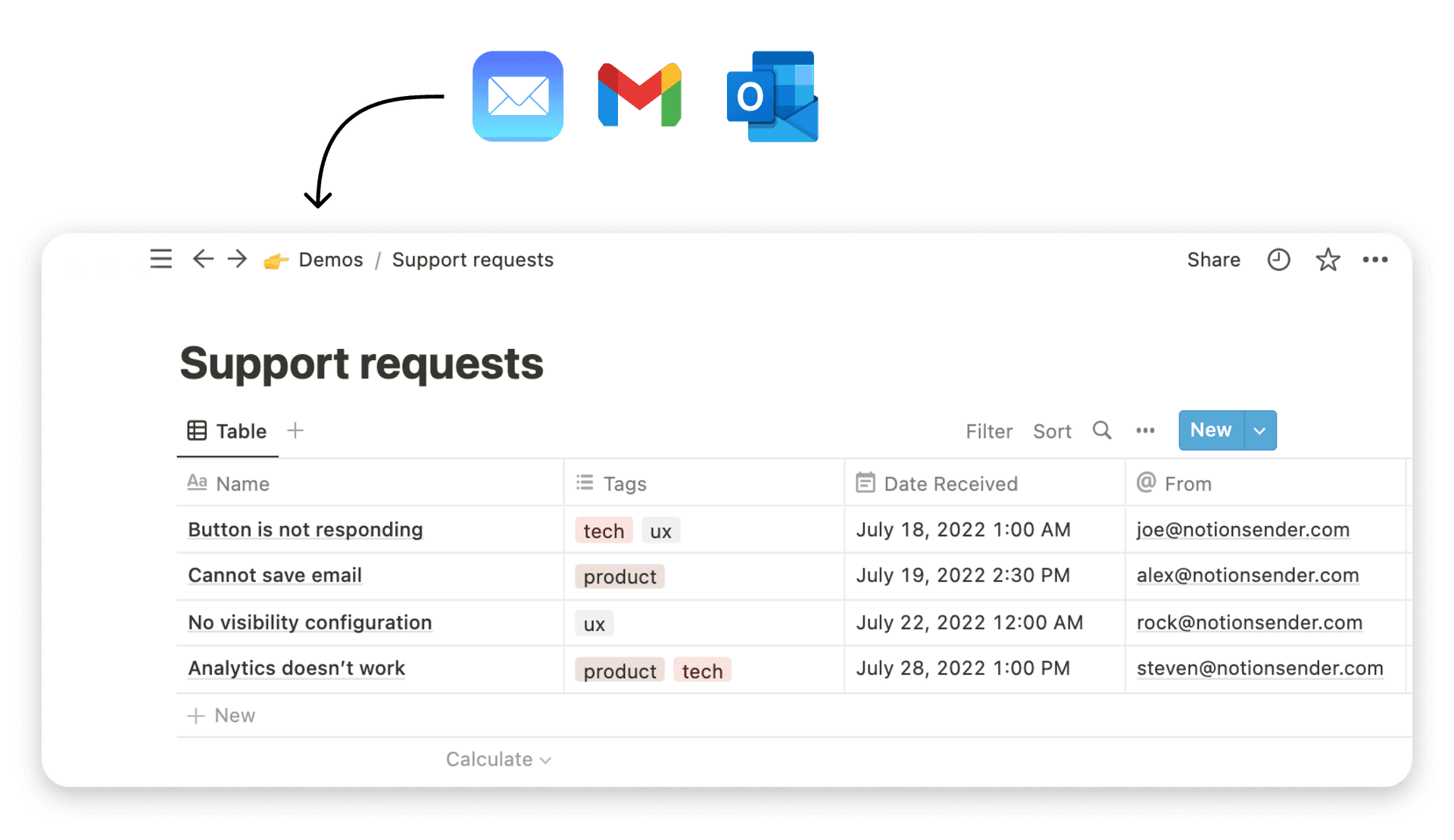
Alright, let's transform that blueprint into a real, working template inside NotionSender. This is where the design plans become a functional, time-saving asset that you can use over and over again. We're going to get hands-on with the drag-and-drop editor and piece together the core components.
The real goal here isn't just to build a single email. It's to create a flexible system of content blocks you can reuse. Think of it like building with LEGOs—you're creating individual pieces like a header, a footer, or a feature block. Later, you can stack, rearrange, or even leave them out for any campaign you can dream up.
Assembling Your Core Content Blocks
The NotionSender editor is designed perfectly for this modular approach, so you don't need to be a code wizard to create a sharp-looking email. Start by dragging the essential structural elements onto your canvas.
First up, let's build the non-negotiable parts of every email you'll send. These are the brand pillars that create consistency and recognition.
- The Header: Think of this as your digital letterhead. Just add an image block and pop in your company logo. Keep it clean, and make sure it links right back to your website's homepage.
- The Footer: This section is super important for both branding and legal compliance. It needs your company's physical address, links to your social media profiles, and—critically—a clear, one-click unsubscribe link.
With those locked in, you can shift your focus to the more flexible body sections. Drag in a mix of text, image, and button blocks to create your main content modules. A common module for a new product feature, for example, might have a headline, a short descriptive paragraph, and a nice product image.
Pro Tip: I always recommend building a few variations of your main body modules. Create one with an image on the left and text on the right, and then another with that layout flipped. This simple trick adds some great visual variety to longer emails without forcing you to start from scratch.
Bringing Your Template to Life with Personalization
A static template is fine, but a dynamic one is where the magic happens. Personalization is what makes your subscribers feel seen, and it’s a proven way to get them to engage. In NotionSender, this is all handled with personalization tokens.
These tokens are just simple placeholders that automatically pull specific data from your Notion database for each person on your list. So, instead of a generic "Hello," you can use {{FirstName}} to greet every subscriber by their actual name.
Getting this right is pretty straightforward:
- Identify Your Data: Take a look at your Notion database. What fields do you have? Common ones are
FirstName,CompanyName, or maybeLastPurchaseDate. - Insert the Tokens: When you're writing your copy in a text block, just type the token exactly as it appears in your database and wrap it in double curly braces (like this:
{{FirstName}}). - Set a Fallback: Always have a backup plan for when data is missing. A simple fallback like "there" ensures your greeting reads "Hello there," instead of an awkward and empty "Hello ."
This small step can make a massive difference in how your email lands. If you want more ideas on integrating Notion with your email workflow, our guide on how to create and send email from Notion is a great place to dig deeper.
Configuring Images and Links for Success
Last but not least, let's get the technical details right to make sure your template works perfectly every time. Broken images and dead links are a surefire way to erode a subscriber's trust.
When you embed images, always remember to add descriptive ALT text. This text does two key things: it shows up if the image fails to load for some reason, and it makes your email more accessible for subscribers who use screen readers. Instead of a generic "image.png," use something helpful like "Blue NotionSender logo."
Proper link configuration is just as vital. For every single link—whether it's on an image or a call-to-action button—double-check that the URL is correct. NotionSender automatically tracks clicks for you, but it can only do that if the link is set up properly in the first place. This data is gold for understanding what content resonates with your audience and for measuring how well your campaigns are doing. By building your template with these details in mind from the start, you're setting yourself up for a much smoother and more effective email process down the road.
Testing Your Template for Flawless Delivery
A beautiful email design is completely useless if it shatters the second it lands in a subscriber's inbox. This next part is all about making sure your hard work pays off with a professional, seamless experience for everyone, no matter where they open your email.
Here's the hard truth: designing for email isn't like designing for the web. Every email client—from Outlook to Gmail to Apple Mail—has its own strange way of reading code. What looks picture-perfect in your test environment might look like a total mess in someone else's. This is exactly why a solid testing process isn't just a "nice-to-have"—it's a non-negotiable step before you even think about hitting send.
The Wild World of Email Rendering
If you have any background in web development, your first instinct might be to use modern CSS and slick HTML. In the email world, that's a fast track to disaster. Many email clients are notoriously old-school and simply don't support the same standards as web browsers.
For instance, desktop versions of Outlook still rely on Microsoft Word’s rendering engine. Yes, Word. This means it often just ignores common CSS properties, which leads to all sorts of formatting nightmares like broken layouts or fonts that don't show up. Gmail is another one—it's known for stripping out certain bits of code, causing unexpected visual glitches.
To get around these classic headaches, email templates have to lean on older, more universally-supported tricks of the trade:
- Inline CSS: Instead of a separate stylesheet, all your styling rules are applied directly to individual HTML elements. It's more tedious, but far more reliable across the board.
- Table-Based Layouts: They might be ancient history for websites, but tables are still the most dependable way to structure an email's layout and make sure it doesn't fall apart.
This flow is a good reminder of the foundational pieces you need in place before you even get to testing.
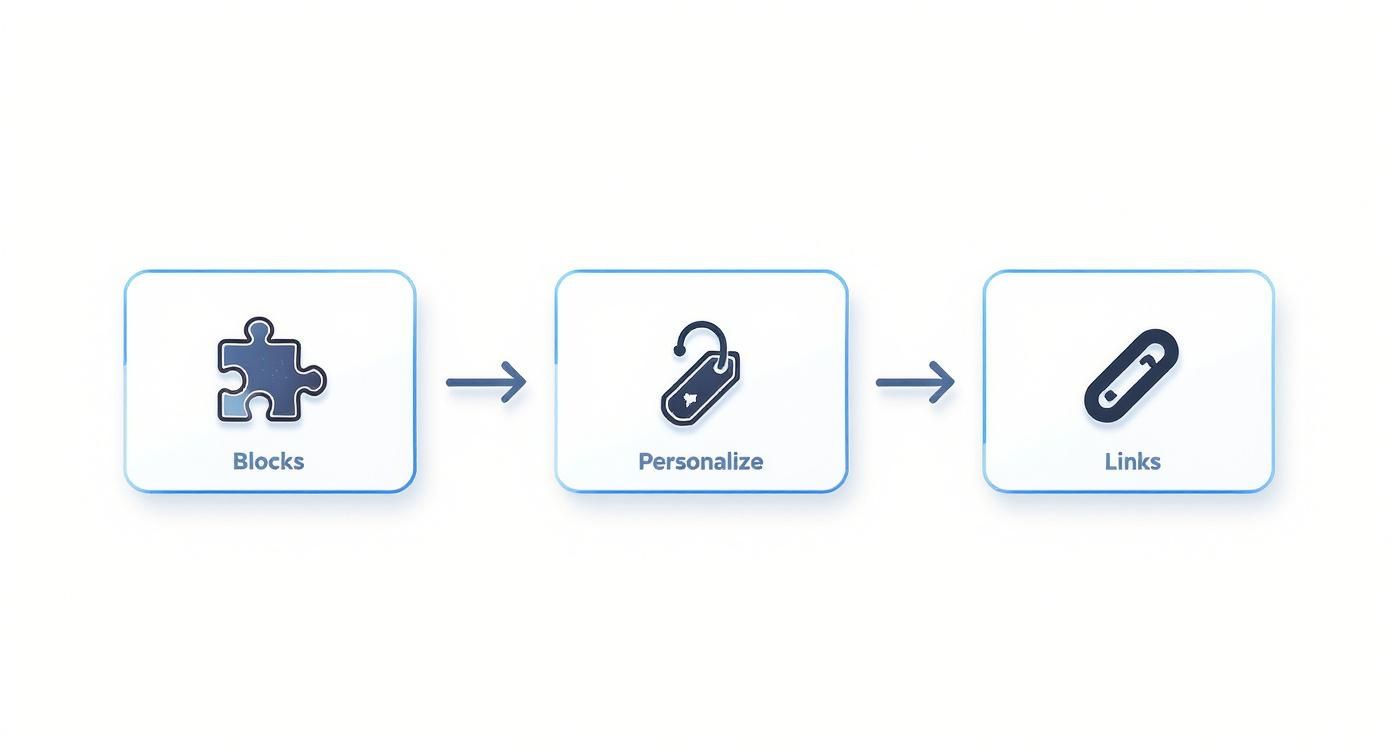
It all comes down to building with modular blocks, adding personalization, and nailing your links. Get that right, and you have a solid template ready for inspection.
Your Pre-Flight Checklist Before Sending
Before you launch any campaign with your new template, you need a simple but ironclad testing plan. This is more than just a quick peek; it’s a systematic check across different environments to hunt down any potential problems. The good news is, you don't have to do it all by hand.
Investing in a dedicated email testing service is one of the smartest moves you can make. Tools like Litmus or Email on Acid can show you previews of your email across dozens of clients and devices in minutes. It will save you hours of manual work and guesswork.
When you're looking at these previews, you're on the hunt for more than just glaring mistakes. Here’s a checklist I always run through:
- Image Rendering: Are all your images loading? Crucially, is the ALT text showing up for people who have images turned off by default?
- Link Functionality: Click. Every. Single. Link. That means your main call-to-action, the social icons, and yes, even the unsubscribe link in the footer. Make sure they all point to the right place.
- Layout Consistency: Keep an eye out for layout breaks, especially in Outlook. Does your single-column design stack cleanly on mobile phones?
- Dark Mode Compatibility: How does your email hold up when a user enables dark mode? Text needs to stay readable and your branding shouldn't vanish. A black logo on a black background is a classic (and easily avoidable) mistake.
Running through this checklist is the final quality check in learning how to create email templates that not only look fantastic but actually work flawlessly in the wild. Taking the time to be thorough here protects your brand's reputation and guarantees your message arrives exactly as you intended.
Taking Your Templates to the Next Level with Advanced Tactics
You've got a solid, reusable template built and tested. That already puts you ahead of the game. Now, let's make that template work smarter, not harder. This is where we go beyond a static design and transform your emails into a dynamic, personalized experience that actually drives results.
Advanced tactics are really all about delivering the right message to the right person at the right time. The secret? It's all in the automation and dynamic content, which can turn a single template into a powerhouse that speaks directly to different customer segments.
<iframe width="100%" style="aspect-ratio: 16 / 9;" src="https://www.youtube.com/embed/ruMtMAVVF_Y" frameborder="0" allow="autoplay; encrypted-media" allowfullscreen></iframe>
Harnessing Dynamic Content Blocks
Imagine sending one email campaign where the content automatically changes based on who's opening it. That’s the magic of dynamic content. Instead of building five different templates for five different audience segments, you create one master template with smart blocks that adapt on the fly.
For example, a subscriber in a cold climate could see an offer for winter coats, while someone in a warmer region sees an ad for shorts—all from the very same email send. In NotionSender, you can set rules for these content blocks based on the data you already have in your Notion database, like location, purchase history, or even engagement level.
This level of personalization is a true game-changer. It makes your audience feel seen and understood, which can seriously boost relevance and click-through rates.
Key Takeaway: Dynamic content isn't just a fancy feature; it's a strategy for scaling personalization. It lets you create highly targeted messages without multiplying your workload, making your communication feel one-to-one, even when you're sending to thousands.
Connecting Templates to Automation Workflows
Your reusable template becomes exponentially more powerful the moment you plug it into an automation workflow. These "set it and forget it" sequences are the real workhorses of any great email marketing strategy, and your template is the vehicle that delivers the message.
Here are a few common—and highly effective—workflows you can build:
- Welcome Series: Trigger a sequence of three to five emails when someone new subscribes. Use your template to introduce your brand, share some valuable content, and maybe present an initial offer.
- Abandoned Cart Reminders: If a customer leaves items in their cart, an automated email using your product block template can gently nudge them to complete their purchase, recovering what would otherwise be lost revenue.
- Re-engagement Campaigns: Got subscribers who haven't opened your emails in a while? A specific workflow can send a targeted offer to win them back and reignite their interest.
Setting up these automations in NotionSender ensures your templates are consistently working for you in the background. As you fine-tune your strategy, remember that even small tweaks can lead to big improvements. For more ideas, you can explore these 10 email marketing tricks to increase your open rates and apply them to your automated sends.
And if your templates feature rich media, knowing how to effectively compress videos for email is a pro move to ensure they look great without wrecking deliverability.
Wrestling with Email Templates? Let's Clear Things Up.
As you start piecing together your first few email templates, you're bound to run into a few common questions. I see them pop up all the time. Getting these fundamentals right from the beginning will save you a ton of frustration and make your campaigns so much more effective.
Let's walk through some of the biggest sticking points people encounter.
What's the Best Width for an Email Template?
If you want a magic number, it’s between 600 and 680 pixels. Seriously, stick to that range. There are solid reasons why this has been the industry standard for years.
First, it just works. This width ensures your email looks great on pretty much every desktop email client without any weird horizontal scrolling. More importantly, it’s the sweet spot for responsive design, allowing your layout to gracefully stack and reflow on mobile screens without turning your content into a jumbled, unreadable mess.
Can I Use My Brand's Custom Fonts in Emails?
I get it, the temptation to use your slick, branded fonts is strong. But in the world of email, it's a gamble you’ll usually lose. The hard truth is that most email clients, especially big ones like Outlook, just won't render them.
Your best bet for body copy is to play it safe with web-safe fonts like Arial, Helvetica, Georgia, or Times New Roman. This ensures everyone can actually read your message. If you absolutely need that branded font for a headline, the best workaround is to render it as an image. Just don't forget to add descriptive ALT text for those who have images turned off.
My Two Cents: Readability should always win over perfect brand alignment. A simple, web-safe font that works for your entire audience is infinitely better than a cool custom font that only half of them can see.
How Can I Stop My Emails from Landing in Spam?
Keeping your emails out of the dreaded spam folder is part art, part science, and it starts with your template's DNA.
Here are a few core practices that make a huge difference:
- Keep your HTML clean and simple. Bloated code is a red flag for spam filters.
- Watch your language. Avoid classic spam-trigger words like "free!" or "act now," especially in subject lines.
- Strike a good balance between images and text. An email that's just one big image is a huge no-no.
- Make your unsubscribe link obvious and easy to find. Hiding it is a sure way to annoy subscribers and hurt your reputation.
Building a clean template is only half the battle. You also need to authenticate your sending domain using SPF and DKIM records. This is like showing your ID to the email providers, proving you are who you say you are and building that crucial sender trust.
Ready to build and send beautiful emails right from your favorite productivity tool? With NotionSender, you can manage entire campaigns, set up automations, and design stunning templates without ever leaving your Notion workspace. Start streamlining your email marketing today.