7 Notion website examples You Should Know

You open a Notion page, change the cover, tidy the headings, hit Publish, and then realize it still feels more like a shared workspace than a real website. That moment is usually what starts the search for notion website examples. You are not only looking for inspiration. You are trying to figure out what turns the same raw material into something people can browse, trust, and remember.
The appeal is easy to understand. A freelancer might already keep case studies in Notion. A small business owner might draft service pages there. A marketer might manage a content calendar and blog ideas in the same workspace. Using that content as the starting point for a site feels lighter than rebuilding everything in a traditional website builder. That saves time, and it avoids the familiar trap where a simple website project turns into a second job. Netcode’s piece on Why DIY Web Design Often Hurts More Than It Helps explains that tradeoff well.
There is also a practical reason this category keeps growing. Notion publishing is no longer a niche workaround. It has become a real option for portfolios, blogs, help centers, documentation hubs, and lightweight business sites.
Still, the hard part is not publishing. The hard part is choosing the right layer on top of Notion.
That is where many roundups fall short. They show attractive screenshots, mention a few templates, and stop before the useful questions begin. Can this tool handle a blog archive cleanly? Does it work better for documentation than for a service business site? Will it help with search previews, navigation, branding, or custom domains, or are you still basically sharing a dressed-up doc?
This guide focuses on those decisions. Each example below shows a different way to turn Notion into a public-facing site, with attention to the tradeoffs people often miss on the first pass. If you want stronger fundamentals before comparing tools, these tips for getting more out of Notion will help, too. The goal is not to collect pretty examples. It is to help you recognize which setup fits the kind of site you are trying to build.
1. Super

Super is one of the clearest examples of what people usually want when they say, “I like Notion, but I want my site to look less like Notion.”
It keeps the Notion-first workflow. You still write and organize content inside Notion. Super then adds a more polished presentation layer on top, with stronger theming, better branding options, and a cleaner path to a custom public site.
Why Super stands out
Super is useful when plain Notion publishing feels too bare, but a full rebuild in another system feels unnecessary.
A lot of notion website examples fall into this middle ground. You want speed and simplicity, but you also want control over navigation, typography, page structure, and search appearance. Super is built for that tension.
Its public gallery also matters. Seeing real sites across portfolios, landing pages, and business pages helps you move from vague inspiration to concrete pattern-spotting. Instead of asking, “Can Notion do this?” you can ask, “Which structure here matches my use case?”
If you already manage your content in databases, Super makes more sense than restarting in a separate CMS.
Best fit and tradeoffs
Super works well for:
- Freelance portfolios: You can keep project pages in Notion and publish them with a cleaner visual layer.
- Small business sites: Service pages, team bios, FAQs, and lead pages are easier to update when they stay inside one workspace.
- Lean marketing pages: It suits teams that want a site live quickly without handing every change to a developer.
The tradeoff is complexity. More options usually mean more decisions. If you like tinkering with design, that is a plus. If you want the shortest route from page to publish, another tool may feel lighter.
Custom domains also sit behind a paid path, so Super tends to make the most sense once your site has a real business purpose.
A practical way to use it
One smart use of Super is to separate your content work from your publishing work.
Write in Notion. Organize with databases. Keep your project case studies, blog entries, or service pages in a structure that is easy to maintain. Then use Super to handle presentation.
If your workspace is already busy, these tips for getting more out of Notion.so help before you publish anything. A cleaner internal structure usually produces a better public site.
A simple test works well here. Build one homepage, one services page, and one proof page. If the design controls feel worth the extra setup, Super is often the right upgrade from native Notion publishing.
2. Potion

Potion is for people who care less about “Can I publish this?” and more about “Will this load fast, look clean, and hold up in search?”
That focus changes the type of notion website examples you should study. With Potion, the interesting examples are not just attractive. They show how a database-heavy Notion setup can become a more finished site.
Where Potion fits best
Potion is especially strong for websites that grow over time.
A portfolio with many case studies. A resource hub. A blog with category pages. A careers section. Those setups can become unwieldy if you treat them like one long public Notion page. Potion helps by turning that content into a more site-like experience with prettier URLs, custom domains, and site-level styling.
The filterable showcase is useful because it lets you compare examples by use case instead of scrolling through random designs. That makes the learning process faster. A consultant can study portfolios. A startup can study resources or careers pages. A creator can study blogs.
What makes it practical
Potion’s static-site approach is often what attracts more technical users or SEO-conscious marketers. Even if you are not technical, the practical takeaway is simple. The site feels more like a conventional website and less like a document wrapper.
Its strengths include:
- Fast output: Helpful for content-heavy or public-facing pages.
- Use-case sorting: Easier to find examples relevant to your business.
- Site-level customization: Good when branding matters but you still want to author in Notion.
The tradeoff is that some custom work can get more technical. If you want unusual layout behavior, custom styling, or embedded tweaks, you may need more patience than with simpler tools.
A strong workflow for teams
Potion is a good match when Notion is already central to your content process.
A small team can draft content in one place, review it internally, and publish without rebuilding the same page elsewhere. That gets even more useful if your website supports outreach or client communication. For example, if forms, updates, or lead notes end up back in Notion, your site becomes part of an operational workflow instead of a standalone brochure.
That is where ways to use Notion to send emails and more become relevant. The point is not just publishing pages. It is connecting the site to the rest of your work.
Potion makes the most sense when your public site is really a front end for a living Notion system behind it.
If you publish often and want a more site-like result from the same underlying workspace, Potion deserves close attention.
3. Simple.ink

Simple.ink appeals to a different kind of user. Not the person chasing maximum control. The person chasing momentum.
If your main problem is getting stuck before launch, Simple.ink is easy to understand. It gives you a straightforward examples-to-template-to-publish path, which is exactly what many non-technical teams need.
Why beginners often prefer it
Some notion website examples are inspiring but not actionable. You see a polished site, but you cannot tell how close it is to a realistic first version of your own website.
Simple.ink reduces that gap. The public examples list leads naturally into templates and then into publishing. That flow matters because it mirrors how most small businesses build sites. They do not start with a blank page. They start with, “I want something like that.”
This makes Simple.ink a good fit for:
- Consultants and freelancers: They can copy a simple structure for services, testimonials, and contact information.
- Internal teams publishing help pages or mini-sites: They can move quickly without design-heavy decisions.
- Business owners replacing an outdated placeholder site: They can get a cleaner public presence without learning a full web stack.
The hidden advantage
The biggest advantage here is not just speed. It is reduced decision fatigue.
You can study live examples, pick a direction, and move. For many people, that is the difference between publishing this week and endlessly revising a half-finished homepage.
That same practical bias matters if you want the site to support communication, not just presentation. A public page that collects inquiries, displays service info, and connects back to your workspace is far more useful than a pretty static page no one updates.
If that is your goal, sending emails from Notion becomes part of the website conversation. A site should help you continue the relationship after someone visits.
Limits to watch
Simple.ink is easiest when you stay close to its intended setup.
If you want a highly unusual layout or a very custom brand treatment, you may feel constrained. Its biggest strength is that it simplifies the path. That can also mean it is less flexible around edge cases.
A good way to evaluate it is to ignore the nicest examples at first. Look for the simplest live customer sites in its gallery. If those already meet your needs, Simple.ink is probably a better choice than a more advanced builder you will only half use.
4. Feather

A founder publishes three strong articles from Notion, then hits a familiar wall. The homepage looks fine, but the blog still feels improvised. Posts are hard to organize, email capture is weak, and it is not clear which articles are earning attention.
Feather is built for that stage.
It treats Notion less like a simple page publisher and more like the back office for an editorial site. If your list of notion website examples includes blogs, resource centers, founder essays, or SEO-focused publishing, Feather deserves a close look.
Best for content-led sites
Some tools are strongest when you need a polished public site with a few pages. Feather is stronger when the article library itself is the main asset.
That changes what matters. You stop judging the tool only by homepage styling and start judging it by repeatability. Can you publish often? Can readers browse old posts easily? Can each article guide someone to subscribe, reply, or explore another page?
Feather focuses on the parts content teams usually care about most:
- SEO settings for individual articles and site structure
- Analytics so you can see which posts attract readers
- Newsletter capture to turn visits into subscribers
- Comments for audience feedback and discussion
- Localization for multi-language publishing
- Multiple site support for teams managing more than one content property
A good analogy is a difference between hanging one framed poster and running a small magazine. Both involve publishing. Only one needs systems for archives, categories, reader paths, and ongoing output.
What to examine in real examples
Feather examples are useful because they show details many roundups skip.
Do not just scan the hero section. Open a few articles and inspect the working parts:
- Archive pages: Can a reader understand the full library quickly?
- Category structure: Are topics grouped in a way that invites further reading?
- Article formatting: Do long posts stay readable with headings, callouts, and spacing?
- Conversion paths: Is there a clear next step, such as subscribing or contacting the team?
Those details determine whether a content site feels like a real publication or just a collection of isolated pages.
Why Feather stands apart
Notion can publish content on its own, but serious publishing usually needs more structure around the content layer.
Three areas matter here.
- Search visibility: Titles, descriptions, and clean indexing affect whether articles can be found.
- Reader flow: Blog traffic should lead somewhere useful, whether that is an email signup, a product page, or another article.
- Ongoing publishing: A content system should still work well after the twentieth post, not only on launch day.
A content site's success depends entirely on what readers do. Do they arrive from search, read past the introduction, click into related posts, and subscribe? Or do they bounce after one page because the site offers no clear path?
That is why Feather appeals to teams treating content as a growth channel rather than a side project.
If articles are part of your acquisition strategy, choose a tool that handles Notion like a CMS, not just a visual wrapper.
The tradeoff
Feather is more specialized than broad website builders. That specialization helps if your main job is publishing and improving content over time.
It can feel restrictive if your priority is a highly custom marketing site with many unusual page layouts. A simple test helps: ask whether the blog supports the website, or the website supports the blog.
Feather is usually the better fit for the second case.
5. Notaku

A visitor opens your site with a narrow question. How do I reset permissions? Where is the API limit? What changed in the latest release? In that moment, the site succeeds or fails based on how fast the answer appears.
Notaku is built for that kind of job.
Its best examples are not flashy portfolio pages. They are working reference sites such as documentation hubs, help centers, changelogs, roadmaps, and private knowledge portals. The goal is simple: reduce the number of questions that reach your team because the site already answered them clearly.
Why Notaku feels different
Notaku shifts the evaluation standard. A docs site is judged less by the homepage design and more by whether a reader can move from question to answer without friction.
That changes what matters.
Search matters because readers often arrive with terms in mind, not a page title. Sidebar navigation matters because a growing knowledge base needs visible structure. Feedback tools matter because they show which articles solved the problem and which ones created more support work. Features like multi-language support, password protection, and subdirectory support also matter because docs rarely stay small for long.
A practical way to picture it is a library versus a poster. A poster can look great from a distance. A library has to help people find the right shelf, then the right book, then the right page.
Where Notaku fits best
Notaku usually makes sense for teams publishing information people need to reuse, revisit, and search.
It is especially useful for:
- SaaS documentation
- Customer help centers
- Public changelogs
- Internal or client-facing knowledge portals
The showcase helps here because the examples are tied to real use cases, not just polished demos. That gives you a better model for evaluating structure, search behavior, and navigation depth.
What to check in the examples
A lot of articles stop at appearance. That misses the harder part.
If you are reviewing docs-focused notion website examples, test them like a user who is in a hurry. Open the site and try to answer one specific question. Then check whether the path feels obvious or whether the interface makes you work for basic information.
A few details are easy to overlook:
- Search clarity: Can users predict the right keyword and get useful results?
- Navigation depth: Can the menu handle many sections without becoming messy?
- Content growth: Will the structure still make sense after dozens of articles or docs pages?
- Access control: Can some content stay private while other pages remain public?
Those are the details that separate a nice-looking docs site from one that lowers support load.
The limitation to accept
Notaku is specialized. That focus is helpful if your site’s main job is answering questions.
It is a weaker fit for broad marketing sites that depend on campaign pages, unusual layouts, or heavy homepage experimentation. If you need brand storytelling first, another tool will usually give you more freedom.
If you need visitors to find answers on their own, Notaku is one of the clearest fits on this list.
6. Popsy
A common situation looks like this. You know the kind of site you need, maybe a portfolio, a small service page, or a creator hub, but the harder question is how to arrange the page so it feels clear from the first screen. Popsy is useful at that stage because it gives you ready-made structures you can study, not just a publishing tool.
Popsy sits a little differently from the more Notion-native builders on this list. Its value comes from a familiar block-style editing experience, a large template library, and live demos that let you inspect layout choices before you commit. For many users, that is the missing step between "I have content" and "I know how this site should flow."
Why Popsy earns a place here
People searching for notion website examples are often trying to solve an architecture problem before a software problem. They are asking practical questions that design galleries rarely answer well.
Questions like these:
- What belongs above the fold on a portfolio homepage?
- How should a solo consultant present services without overwhelming visitors?
- What sections make a link-in-bio page feel useful instead of cluttered?
- Where should testimonials, pricing, or contact options appear on a one-person business site?
Popsy helps because you can compare those answers side by side. That matters more than it sounds. A template is not just decoration. It is a working example of page order, content grouping, and visitor priorities.
Where Popsy fits best
Popsy works well for quick-launch sites where speed and clarity matter more than deep Notion syncing. Personal sites, landing pages, creator pages, small business homepages, and early prototypes are all strong fits.
The distinction is simple. Some tools treat Notion as the content engine and turn your workspace directly into a site. Popsy is closer to a visual shortcut for people who want a familiar editor and a polished result without spending days on layout decisions.
That difference matters when you compare tools. If your site depends on Notion databases doing heavy lifting in public, another option may fit better. If your bigger problem is "I need a clean site structure by this afternoon," Popsy starts to make a lot of sense.
What to examine in its examples
The useful lesson in Popsy is not "pick a nice template and move on." The useful lesson is understanding why simple pages feel easy to scan.
A good Popsy template often follows a pattern like this:
- First screen: Clear identity. Who you are, what you offer, and one next step.
- Middle of page: Proof. Testimonials, client logos, results, or selected work.
- Lower sections: Offer details. Services, packages, FAQ, or process.
- End of page: Contact path. Form, email, booking link, or call to action.
That sequence works like a short conversation. Introduction first. Evidence next. Details after trust is established. Action at the end.
Small decisions matter here too, and many articles skip them. Check how much text appears in each section. Notice whether buttons repeat at logical points or only once. Watch how templates separate different goals. A visitor who wants to hire you should not have to dig through the same block of text as someone who only wants to browse your work.
Popsy is also a good reminder that many effective notion website examples are structurally modest. They do not win by adding more sections. They win by making each section do one clear job.
Popsy is less about turning Notion into a public database-driven site and more about helping you choose a page structure that already works. If you are stuck at the "what should this page include?" stage, that is a practical advantage.
7. Notion Sites (official)

You already have a polished Notion page. The question is simple. Do you really need another tool on top of it?
Notion Sites matters because it sets the floor for this whole category. If the built-in publishing option already covers your needs, every added layer becomes a tradeoff. You may gain design control, but you also add setup time, another dashboard, and one more system to maintain.
That makes the official option a smart first test for portfolios, resume sites, simple blogs, documentation pages, resource hubs, and small business pages with modest design needs.
Why the official option matters
Native Notion publishing became far more practical once public pages were easier to share and custom domains became available. The result was straightforward. Notion stopped feeling like only a workspace and started working as a real website option for many creators and small teams.
The advantage is proximity. Your content, editing workflow, and published site all live in the same place. That sounds small, but it changes behavior. A site that is easy to update tends to stay current. A site that requires exporting, syncing, or rebuilding often falls behind.
That is the part many roundups skip. The official tool is not mainly competing on visual polish. It is competing on maintenance cost.
A useful real-world pattern
A strong official example is the Optemization site featured in Notion’s customer materials, as noted earlier in the article. What makes it worth studying is not the fact that it is public. It is how the structure uses Notion’s strengths.
The site organizes work like an operating document, not a decorative brochure. Visitors can move through client pages with clear categorization, and the content stays tied to the same system the team already uses internally. That is a practical model for agencies, freelancers, and consultants who want a site that also works as a living archive.
The lesson is easier to see with a simple comparison. A traditional brochure site often behaves like a printed flyer uploaded to the web. A native Notion site can behave more like a well-labeled filing cabinet. Each project, case study, or resource can be its own page, with properties and tags doing real organizational work.
What to examine in official examples
Look past the homepage and study how the page system works:
- Database-backed content: Projects, resources, or case studies are easier to maintain when each entry follows the same structure.
- Visible page hierarchy: Breadcrumbs, subpages, and table of contents blocks help visitors move through dense information.
- Property discipline: Tags, dates, service types, or status labels only help if they are consistent across pages.
- Update behavior: Check whether the site seems built for regular edits, not just a one-time launch.
Those details matter because native Notion works best when the website is closely connected to ongoing work. If you publish a portfolio, research library, knowledge base, or project archive, that connection is a real advantage.
When native Notion is enough
Choose Notion Sites when speed, clarity, and easy updates matter more than heavy customization.
It is often enough for a first version. It is also enough for many final versions.
The limits are clear. Design freedom is narrower, branding options are simpler, and advanced SEO or app-like experiences usually call for a wrapper tool later. But if your main goal is to publish useful information cleanly and keep it current without extra systems, the official option deserves a serious look before you add anything else.
7 Notion Website Builders - Quick Comparison
| Tool | Implementation Complexity 🔄 | Resource Requirements ⚡ | Expected Outcomes ⭐📊 | Ideal Use Cases 💡 | Key Advantages ⭐ |
|---|---|---|---|---|---|
| Super | Medium–High (🔄 feature-rich; steeper learning curve for advanced theming) | Moderate (⚡ paid plan for custom domains; design/dev skills for deep theming) | High quality, fast SEO-friendly sites (⭐📊 strong performance and discoverability) | Notion-first portfolios, landing pages, designers who want control | Deep design control; large examples/templates library |
| Potion | Medium (🔄 SSG-focused; some custom CSS/embeds for advanced tweaks) | Moderate (⚡ supports custom domains, CSS/fonts; some technical setup) | Fast static sites with good SEO (⭐📊 optimized multi-page output) | Multi-page or database-heavy Notion sites, blogs, portfolios | Filterable showcase; strong SSG performance and SEO controls |
| Simple.ink | Low (🔄 rapid setup; minimal configuration for common patterns) | Low (⚡ template-driven; migration help; aimed at non-technical teams) | Quick, consistent launches (⭐📊 reliable results when using provided themes) | Non-technical teams, simple company pages, help centers | Fast examples→template→publish workflow; accessible UX |
| Feather | Medium (🔄 content- and SEO-focused features to configure) | Moderate–High (⚡ advanced SEO tools, analytics, newsletter integrations; higher pricing) | High organic traffic potential (⭐📊 optimized for content marketing/SEO) | Content-driven blogs, publishers, SEO-first sites | Strong SEO tooling, analytics, named brand examples |
| Notaku | Low–Medium (🔄 specialized for docs with focused feature set) | Moderate (⚡ built-in search, localization, password protection; some setup) | Polished documentation/support sites (⭐📊 improved self-serve UX) | Product docs, knowledge bases, changelogs, help desks | Intentional docs UX (search, nav) and verified customer showcases |
| Popsy | Low (🔄 simple Notion-like editor; minimal learning curve) | Low (⚡ many free templates, free popsy.site domains; one-plan pricing) | Fast prototypes and simple sites (⭐📊 quick visual results) | Rapid prototyping, simple landing pages, demos | Large template library with live previews; low friction |
| Notion Sites (official) | Very Low (🔄 instant publish from Notion; minimal setup) | Very Low (⚡ included with Notion plans; custom domain add-on optional) | Immediate public pages with basic features (⭐📊 limited developer features) | Simple portfolios, blogs, wikis, internal docs | Zero friction publishing; first-party stability and learning resources |
Final Thoughts
The best notion website examples are not always the flashiest ones. They are the ones that match the job.
That job might be publishing a personal portfolio fast. It might be building a cleaner marketing site from an existing workspace. It might be creating a blog that can grow, or a support center that helps customers answer their own questions. The right tool depends less on taste and more on workflow.
That is why these seven options are worth separating instead of lumping together.
Super works well when you want a more polished presentation layer on top of Notion. Potion is strong when performance, SEO, and a more site-like output matter. Simple.ink lowers the launch barrier for non-technical teams. Feather focuses on content-led publishing. Notaku is designed for documentation and support. Popsy helps you prototype structure and design quickly. Notion Sites remains the simplest official starting point.
There is also a bigger lesson behind the rise of notion website examples. The website itself is no longer the whole system. For many small businesses, the website is just one part of a workflow that includes content management, inquiries, updates, analytics, client communication, and follow-up.
That matters because there is still a gap in the ecosystem. Existing resources often focus on design choices like colors, columns, and layouts, while giving far less attention to email handling and communication flows tied to public Notion sites. That gap is especially relevant for freelancers, project managers, and small business owners who need a site to do more than look good. They need it to support inquiries, scheduling, invoices, updates, and client coordination in one operational loop.
So when you review notion website examples, do not stop at the homepage.
Look at how the site is maintained. Look at whether content comes from databases or static pages. Look at whether the examples support one-time publishing or ongoing updates. Look at how a visitor moves from reading to contacting you. Those details usually tell you more than the design style itself.
A good rule is to choose the least complex setup that still supports your real process.
If native Notion publishing is enough, start there. If your site needs a better front end, move to a wrapper. If your main asset is content, pick a content-focused tool. If your public presence is tied to support or documentation, choose a docs-first platform.
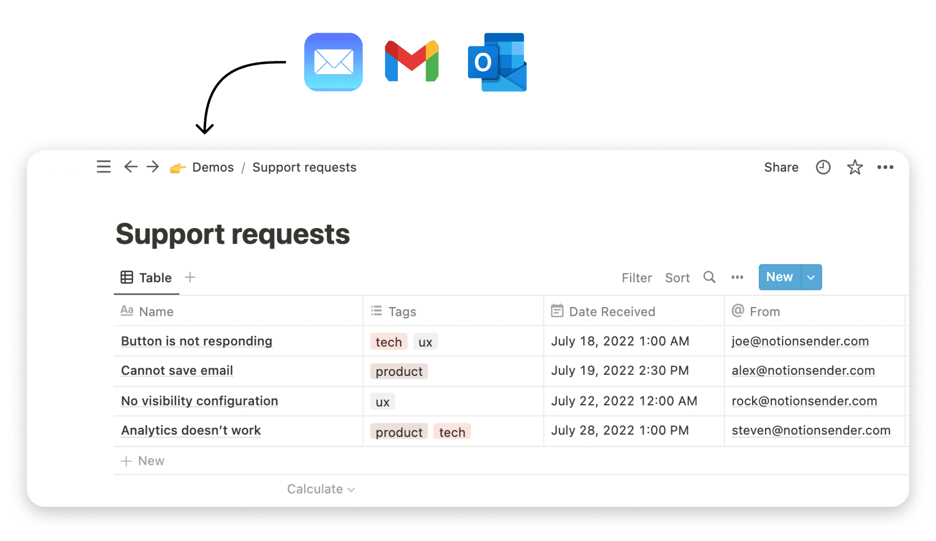
And if your workflow depends on keeping communication inside Notion, a tool like NotionSender can fit naturally beside your website setup by handling email activity within your workspace. That is useful when the site is part of a broader business process rather than a standalone page.
The strongest Notion sites usually share one trait. They are easy to update because the owner uses the system behind them. That is what makes them sustainable.
If you want your Notion website to connect more directly with inquiries, follow-ups, and ongoing client communication, NotionSender is worth a look. It lets you send and receive emails inside Notion, save messages to databases, and support workflows where your website and workspace stay closely connected.