A Guide to the Two Columns Layout for Notion and Web Design

A two-column layout is one of those simple design tricks that fundamentally changes how you work. It’s just what it sounds like: your content is split into two vertical sections, side-by-side. You've seen it everywhere, and for good reason—it’s fantastic for comparing information, juggling tasks, and bringing a sense of order to busy pages, especially in an app like Notion.
Why a Two-Column Layout Is a Productivity Game-Changer

This isn't just about making things look tidy. Splitting your workspace into two columns is a legitimate strategy for working smarter. By giving your information two distinct lanes, you cut down on the mental effort it takes to process everything. Think about it: no more frantic tab-switching or endless scrolling. Everything you need is right there.
I find that I can get through data so much faster when it's neatly compartmentalized. If I'm reviewing a project, I’ll keep my task list in one column and all the reference files or notes in the other. This gives me instant context without having to jump around. It’s the secret sauce behind effective project boards, dashboards, and, of course, streamlined email workflows.
Enhancing Clarity and Focus
One of the biggest wins of a dual-column setup is how it directs your attention. Our brains love organized patterns, and splitting the screen creates a natural path for your eyes to follow. This is a huge help anytime you need to compare things or track two streams of information at once.
- Project Management: I'll often put a list of projects on the left, and when I click one, its full details and tasks pop up on the right.
- Meeting Notes: The left column is for the agenda. The right is where I jot down notes, decisions, and action items for each point as we go.
- Email Workflows: You can mimic a classic email client by having your inbox list in one column and the selected email's content in the other.
It reminds me of a simple "Past Year Review" I do. I just make two columns—one for wins, one for losses—and analyze the year. That simple structure forces you to be clear and makes it so much easier to spot what’s working and what isn’t.
A Foundation for Advanced Workflows
If you're using NotionSender, mastering the two-column layout is your key to centralizing everything. You can build out an entire email command center right inside Notion. One column can hold your email database, while the other is where you draft replies or check attachments. It turns a static page into a truly interactive workspace.
For a deeper dive on getting your inbox under control, our guide on email management tips to boost your productivity is a great next step.
In this guide, I’ll walk you through exactly how to create this layout in Notion, build it from scratch with HTML/CSS for a website, and apply it to some real-world examples you can start using immediately.
Creating Your First Two Columns Layout in Notion
Getting a two-column layout going in Notion is surprisingly simple. It’s all built around a drag-and-drop move, but the real magic comes from knowing why and how to use it to bring order to your pages. Let's skip the dry instructions and build something useful right now.
Think about a typical project page—say, for a new marketing campaign. It’s probably a long, scrolling list of tasks, brain-dumped notes, and random links. It’s functional, but it’s messy. By adding just two columns, you can create an instant dashboard.
The Drag-and-Drop Method
The main action here couldn't be easier. First, write some text or create any block that you want to start your second column.
Now, just click and hold that block. Drag it all the way to the right side of another block already on the page. A thin, vertical blue line will pop up—that’s Notion telling you it's ready to create a column. Let go, and just like that, you’ve got a two-column layout.
You can now pull any other block—text, images, to-do lists, even entire databases—into either of the columns. This is how you start turning that chaotic page into a clean, focused workspace.
A personal rule I stick to is putting action items on the left and reference materials on the right. This creates a natural flow, keeping your focus on the work that needs doing while having all the supporting info right there when you need it.
Let's apply this to our marketing campaign example.
- Left Column (Active Work): Start with a to-do list for your "Active Tasks." I'd also add a heading for "Next Steps" to keep immediate priorities impossible to miss.
- Right Column (Reference): Add a "Reference Materials" heading. Under it, you can embed your Google Docs, paste links to competitor research, and drop in images for ad mockups.
In less than a minute, your page feels ten times more organized.
Balancing and Refining Your Layout
Once your columns are set up, you’ll see a faint gray vertical line appear between them when you hover your mouse. You can click and drag this divider to change the width of each column.
I usually make my main "action" column a bit wider—around 60% of the page width—to give the most important stuff more breathing room.
One thing you absolutely have to consider is how a two-column layout looks on a phone. Notion automatically stacks your columns vertically on smaller screens, placing the right column underneath the left one. Always build your page so it still makes sense when read from top to bottom. Putting your most critical info in the left column guarantees it's the first thing you see, no matter the device.
Supercharge Columns with Synced Blocks
Here's a pro tip for keeping things consistent across your workspace. If you have a piece of information that needs to show up on multiple pages—like team goals, a quick contact list, or a mission statement—you should be using a Synced Block.
Just create your block of content, click its block handle, and choose "Turn into Synced Block." Then hit "Copy and sync." You can now paste this block on any other page in your workspace. The best part? When you edit it in one spot, it updates everywhere else automatically.
Placing these inside a column is a great way to create a consistent sidebar or header across all your project pages without any copy-paste headaches. To dig even deeper into the platform, check out these 10 tips to help you get the most out of Notion.
Building an Email Hub with a Two Columns Layout
Alright, let's turn your Notion workspace into a full-blown email command center. We're going to build a slick two columns layout that’s especially powerful if you're using NotionSender. The idea is to create a setup that feels just like a professional email client.
Imagine your standard email app. You've got a list of emails on the left and the content of the selected email on the right. That’s exactly what we're aiming for here—a familiar, dual-pane view that turns a simple Notion database into a productivity machine.
Creating columns in Notion is pretty straightforward. It's all about dragging and dropping blocks next to each other.

You just grab a block, move it to the far edge of another, and a blue line appears, showing you where the new column will form. Drop it, and you’re set.
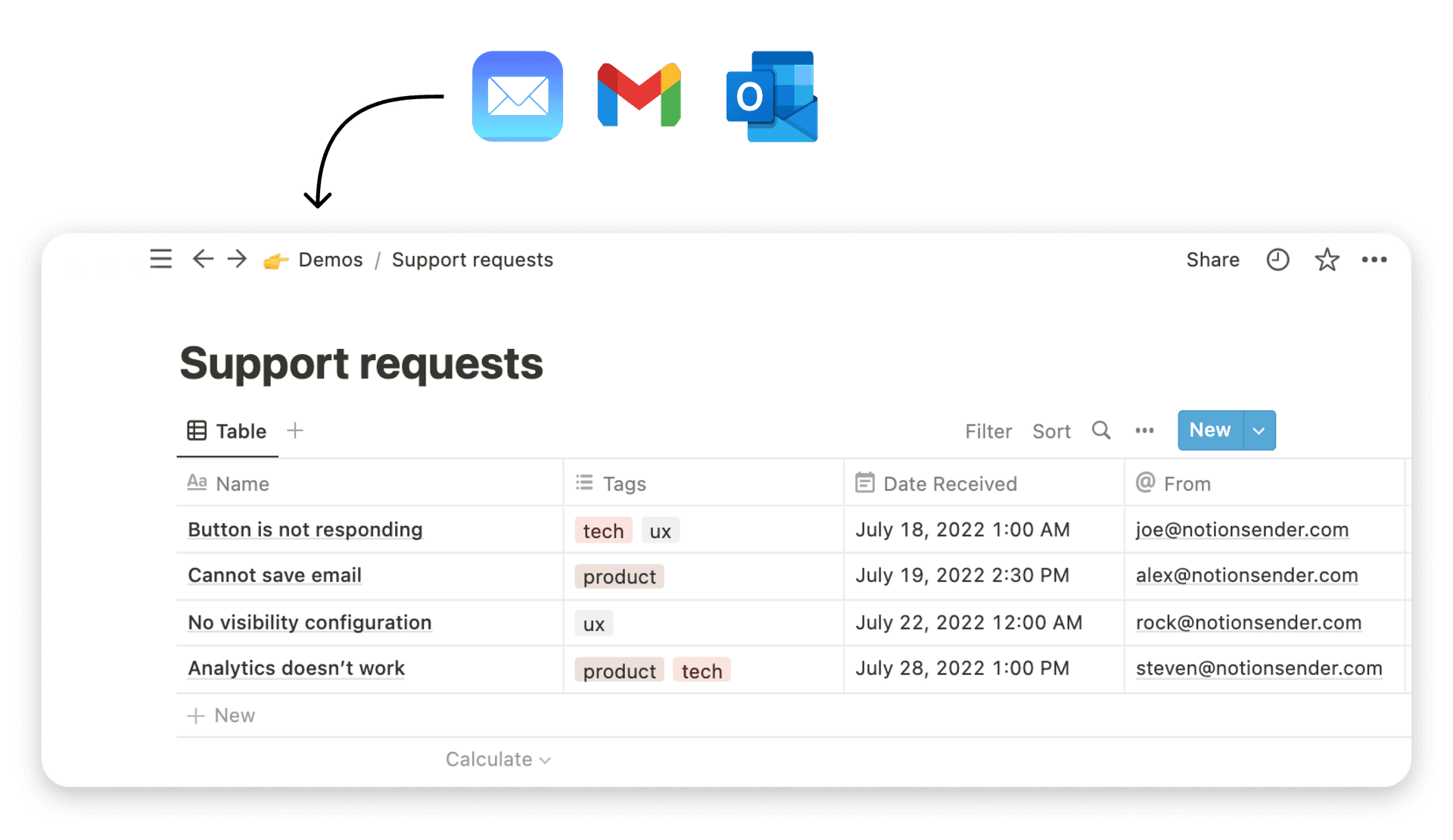
The Foundation: Your Email Database
The engine behind this entire setup is a single, well-organized Notion database. The first step is to create a new page for this database. Once that's done, you'll return to your main dashboard page, where the real magic happens.
For this to work as an email hub, your database needs the right properties to capture data from NotionSender and help you manage the workflow.
Here’s a good starting point for your properties:
- Status: Use a Select property to track an email's state. I find 'To-Do', 'In Progress', 'Awaiting Reply', and 'Done' work great.
- Sender: A simple Text or Email property is perfect for capturing the sender's address automatically.
- Subject: This will be your main Text property for the email's subject line.
- Received Date: A Date property to log exactly when the email landed.
- Next Action: I love using a Text property for this. It’s where you can jot down a quick note to yourself, like "Follow up by EOD" or "Forward to the design team."
Think of your database as the engine, but the two-column view is the dashboard you'll actually be driving. Separating the list from the content cuts down on visual clutter, letting you fly through your inbox with incredible focus.
Bringing it Together: Your Dual-Pane View
Now that the database is ready, it's time to build the interface on your dashboard. Start by creating your two columns.
In the left column, you’ll insert a Linked View of the email database you just created. For the view type, you can use either a List or a Gallery. Personally, I prefer the List view—it’s compact, scannable, and feels exactly like a classic inbox. Set this view to display key properties like 'Sender', 'Subject', and 'Status' so you can see what’s what at a glance.
Now for the most important part. Click the "..." menu on your linked view and find the "Open pages in" option. Change this to Side peak.
This one setting is what makes the whole two-column workflow click into place.
With this setup, you can scan your emails in the list on the left. When you click one, the full page content slides out neatly on the right. You can read the email, update its status, or type in a 'Next Action' without ever leaving your dashboard. It's a seamless and incredibly efficient way to work.
Of course, a great layout is only half the battle. To get the most out of your new setup, it helps to know how to organize your email effectively.
And to complete the loop, you can learn how to create and send email from Notion, connecting this powerful inbox directly to your outbound messages.
Crafting a Responsive Two Columns Layout with CSS
<iframe width="100%" style="aspect-ratio: 16 / 9;" src="https://www.youtube.com/embed/K24lUqcT0Ms" frameborder="0" allow="autoplay; encrypted-media" allowfullscreen></iframe>
While Notion's built-in columns are great for internal pages, you'll need to jump into CSS when building a two-column layout for a website, blog, or a custom HTML email.
The real challenge isn't just putting two boxes next to each other. It’s about building a responsive structure that looks sharp on a desktop but also stacks cleanly on a mobile phone.
For this, modern CSS offers two fantastic tools: Flexbox and CSS Grid. For years, I defaulted to Flexbox for pretty much everything, but my thinking on this has changed. After building countless layouts, I've found that each one really shines in different situations.
If you’re serious about building robust and adaptable designs, you’ll want to master responsive web page CSS, which covers everything from fluid layouts and media queries to the finer points of Flexbox and Grid.
Flexbox vs. CSS Grid: When to Use Each
Choosing between Flexbox and Grid is a classic point of confusion for many developers. Here’s the simple mental model I've developed over years of work.
-
Flexbox is for one-dimensional layouts. It’s perfect when you just need to arrange items in a single line, either as a row or a column. This makes it my go-to for things like navigation links, a set of buttons in a card, or aligning items inside a header.
-
CSS Grid is for two-dimensional layouts. This is your heavy-hitter for overall page structure. When you need to control both rows and columns simultaneously—like a main content area beside a sidebar—Grid gives you far more explicit and powerful control.
For a traditional two-column page, I almost always start with CSS Grid now. It was literally built for this exact job.
Building with CSS Grid and Media Queries
Let's walk through a practical example: a main content area with a sidebar. The main content will take up most of the space, while the sidebar will be narrower. On smaller screens, the layout will automatically switch to a single column, with the sidebar dropping below the main content.
First, the HTML is straightforward. All you need is a container with two child elements inside.
<div class="two-column-container"> <main class="main-content"> <h2>Main Article Content</h2> <p>This area holds the primary text...</p> </main> <aside class="sidebar"> <h3>Related Posts</h3> <p>Your sidebar content goes here...</p> </aside> </div>
Next comes the CSS to make the magic happen. We'll define the columns with Grid and use a media query to handle the responsive part.
/* Defines the two-column grid / .two-column-container { display: grid; grid-template-columns: 3fr 1fr; / 3 parts for main, 1 for sidebar / gap: 2rem; / The space between columns */ }
/* Media query for stacking on smaller screens / @media (max-width: 768px) { .two-column-container { grid-template-columns: 1fr; / Switch to a single column */ } }
That grid-template-columns: 3fr 1fr; line is where the action is. The fr unit is a fractional unit that represents a fraction of the available space. This tells the browser to give the first element 3 parts of the width and the second element 1 part. It’s an incredibly clean and flexible way to manage proportions.
Here's a key piece of advice: always use the
gapproperty for spacing. In the old days, we had to rely on messy margins, which often caused headaches. Thegapproperty creates clean, consistent gutters in your layout without any extra math or complicated code.
Practical Use Cases for a Two Columns Layout

While building dashboards and complex email hubs shows off the power of columns, I find the real magic is in the everyday stuff. A simple two columns layout can completely change how you create documents and handle your day-to-day communication.
Let's dig into a couple of practical ways you can use this structure right away. The goal is always the same: clarity. When you put related information side-by-side, you help people connect the dots instantly. It makes your point more convincing with less effort.
Enhance Your Marketing and Sales Materials
One of the best applications for a two columns layout is in your marketing and sales assets. It's a natural fit for telling a comparative story, which is the heart of great marketing.
A perfect example is creating a "Before and After" case study.
- Left Column: This is where you lay out the client's problem. Use a few bullet points to list the exact pain points they were dealing with before they found you.
- Right Column: Here, you present the solution. Match each pain point with a positive result, throwing in real metrics and client quotes to build trust.
This direct comparison makes your value crystal clear. You could do the same thing with a feature comparison chart, putting your product in one column and a competitor's in the other. It lets people see your advantages at a glance, no dense paragraphs required.
When you structure your content this way, you're not just presenting facts—you're making your strengths obvious. The side-by-side format naturally positions your solution as the clear choice.
A Better Way to Take Meeting Notes
We've all been there. A meeting ends, and you're left with a jumble of notes that are impossible to turn into action. My go-to strategy to fix this is a dead-simple two-column setup in my Notion meeting notes. It's an absolute game-changer for making sure things actually get done.
I set up my page just like this:
| Left Column: Agenda & Discussion | Right Column: Decisions & Action Items |
|---|---|
| I use this space for the official agenda and to capture the free-flowing discussion that happens during the meeting. It's a record of the conversation. | This column is strictly for the important stuff: concrete decisions and specific action items. I always assign an owner and a deadline (e.g., "Alex to finalize budget by EOD Friday"). |
This separation is what makes it work. Your notes transform from a passive record into an active project plan. As soon as the meeting is over, that right column becomes your instant to-do list to share with the team.
No more hunting through paragraphs of conversation to figure out who's doing what. The two columns layout creates immediate clarity and accountability, fundamentally improving how you run projects that start in meetings.
Common Questions About Two Columns Layouts
Working with a two-column layout can sometimes throw a few curveballs your way, whether you're in Notion or deep in a stylesheet. It's easy to get hung up on a small detail, so I've pulled together the most common questions I run into and answered them directly.
Think of this as a quick guide to get you unstuck and back to building.
How Do I Make My Two Columns in Notion Have Equal Width?
Notion doesn't have a specific "equal width" button, but you can get a perfect 50/50 split with a little manual adjustment. Just hover your mouse in the space between your columns until you see the vertical gray divider pop up. You can then click and drag it to resize things.
Here’s a little trick I use: I drop two identical images into each column. This gives me a fantastic visual guide to get the alignment just right. Once they look perfectly balanced, I just delete the temporary images.
Should I Use CSS Grid or Flexbox for a Two Columns Layout?
Honestly, it really depends on what you're trying to build.
For big-picture page structure, like a main content area next to a sidebar, CSS Grid is my go-to. It’s built to handle both rows and columns at the same time, which makes it perfect for those two-dimensional layouts.
But when I just need to align a few items in a row, like a handful of buttons in a header, Flexbox is often simpler. For a standard two-column blog post, you could use either one, but I find Grid gives you more explicit and powerful control over the entire page structure.
A responsive two-column layout should always "stack" vertically on smaller screens, meaning the right column moves underneath the left. This is essential for readability and a good user experience.
The great thing is, Notion handles this stacking for you automatically. If you're coding it yourself with CSS, you’ll need to use a media query. This is just a small bit of code that tells the browser to switch from a two-column grid to a single-column flow once the screen size drops below a certain width, like 768 pixels.
Finally, people often ask if they can put a Notion database inside a column. The answer is absolutely! It’s a really powerful way to build interactive dashboards. A great example is putting a 'Tasks' database in one column and a related 'Projects' database right next to it.
Ready to turn your Notion workspace into a productivity powerhouse? With NotionSender, you can send and manage emails directly from your new two-column layouts, centralizing your entire workflow. Get started today at https://www.notionsender.com.