Create an Email Sign Up Sheet That Actually Converts

An email sign-up sheet isn't just a box on a page; it's the handshake that starts a conversation. Whether it's a physical clipboard at a craft fair or a digital form on your website, it’s how you get permission to talk directly to people who are interested in what you do.
Think of it as the foundation for your email list—the most critical tool you have for direct marketing and building a genuine community.
Why Your Email Sign Up Sheet Matters More Than Ever
Let's be real: social media algorithms are a black box. You’re essentially renting space on someone else's platform, and the rules can change overnight. Your email list, on the other hand, is an asset you truly own. The humble email sign-up sheet is the gatekeeper to this powerful channel.
This direct line to your audience is only getting more valuable. The number of email users worldwide is staggering and still growing, expected to climb from 4.6 billion in 2025 to over 4.8 billion by 2027. With more than 376 billion emails flying around daily, a smart, well-designed sign-up process is your best shot at building a quality list that people actually want to be on.
From Casual Visitor to Loyal Subscriber
Imagine the journey. Someone stumbles upon your blog, reads a great article, and then sees a sign-up box offering a free checklist related to that topic. That small action—typing in their email—transforms them from a passive visitor into an engaged lead. That moment is a huge conversion point.
An effective sign-up sheet does more than just collect an email; it solidifies interest and provides a clear path for a visitor to deepen their relationship with your brand.
To make sure your forms are actually working for you, it’s worth digging into some proven tips to improve website conversion rates. It's not just about the form itself, but the entire experience leading up to it.
The value exchange has to be crystal clear. Are you offering a discount? Exclusive content? A free template? Whatever it is, that incentive is what pushes someone past their hesitation.
Building Tangible Business Value
A healthy email list, grown from a strategic sign-up sheet, has a direct impact on your bottom line. It's not just a vanity metric; it’s a business asset.
- Owned Audience: You’re in the driver's seat. You control the message and when it gets delivered, without a platform's algorithm getting in the way.
- High ROI: For years, email marketing has consistently delivered one of the highest returns on investment of any marketing channel. It just works.
- Direct Sales: Launching a new product or running a sale? You can announce it directly to a list of people who’ve already shown they're interested.
- Customer Loyalty: This is your space to nurture relationships. By sending valuable, non-salesy content over time, you build a real community around your brand.
Designing a Sign Up Sheet That People Want to Fill Out

Let's be honest, a great email sign-up sheet has very little to do with flashy animations or complex graphics. It really boils down to two things: psychology and user experience. The ultimate goal is to make the decision to subscribe feel both effortless and genuinely valuable to the person on the other side of the screen.
When someone lands on your form, they’re immediately and subconsciously asking, "What's in it for me?" Your design has to answer that question instantly. This means you’ve got to move beyond a generic "Subscribe to our newsletter" headline and get specific about the value you're offering.
Crafting a Compelling Offer
Your headline is the single most critical piece of copy on your form. It needs to promise a clear, tangible benefit. Stop focusing on what you're sending and start focusing on what they're receiving.
For example, a generic headline might say, "Join Our Mailing List." A much stronger version would be, "Get 10 Marketing Tips Delivered to Your Inbox Weekly." See the difference? The second one makes a concrete promise.
The same logic applies to your call-to-action (CTA) button. "Submit" is passive, boring, and feels like work. You need action-oriented text that reinforces the value they're about to get:
- "Get the Free Guide"
- "Send Me the Tips"
- "Unlock My Discount"
These small language tweaks can dramatically change how people see your form. They frame the whole interaction as a win for the subscriber, not just a data collection exercise for you. At the end of the day, these design choices are a core part of how you create a website that converts visitors into loyal fans.
Less Is Always More
One of the biggest mistakes I see people make is asking for way too much information upfront. Every single field you add creates friction and gives someone another reason to just click away. My own experience and countless studies all show the same thing: fewer fields lead to higher conversion rates. It’s that simple.
For a general newsletter, just asking for an email address almost always outperforms forms that also ask for a name. The less work you make them do, the more likely they are to finish.
Think about the context of your request. If you're offering a quick download or a simple newsletter, stick to the absolute minimum.
- Newsletter Sign-Up: Email address only. That's it.
- Webinar Registration: First name and email make sense here, especially for personalized follow-ups.
- Detailed Quote Request: It’s okay to ask for more fields because the user has higher intent and expects to provide more detail.
Building Trust Through Transparency
Finally, trust is the invisible glue holding your entire sign-up process together. People are protective of their inboxes, and for good reason. You can ease their concerns with a couple of simple additions.
A small line of text right below the button, like "We respect your privacy and will never share your email," can make a huge difference. This is often called a privacy policy link or a microcopy trust signal.
Another powerful tool is social proof. Adding a line like "Join 2,500+ other subscribers" validates the decision to sign up. It shows that other people find your content valuable, which reassures new subscribers they're making a good choice.
Alright, let's get down to business and build your first email sign-up sheet. Now that you've got the design principles down, it’s time to roll up your sleeves. The great news is you don't need any expensive, complicated software to get this done. We're going to focus on two incredibly powerful and free tools: Google Forms for its dead-simple setup and Notion for how beautifully it can slot into your existing workspace.
Both of these paths will get you a working form, but they’re tailored for slightly different situations. Google Forms is a fantastic, universal option you can drop just about anywhere. A native Notion page, on the other hand, offers a super clean experience, especially if your audience is already comfortable inside Notion.
Let’s walk through how to build one with each.
Creating Your Form with Google Forms
There's a reason Google Forms is the go-to for so many people: it’s reliable, intuitive, and something most of your audience has seen before. You can whip up a professional-looking form and start collecting emails in literally just a few minutes.
First thing's first, head over to the Google Forms homepage and fire up a blank template. The whole interface is drag-and-drop simple, letting you pop in questions and tweak the design without a single headache.
For a basic email sign-up, here’s all you really need:
- Title: Make it clear and benefit-focused. Something like "Join Our Weekly Newsletter" or "Get Your Free Ebook."
- Description: Add a quick one-liner explaining exactly what they'll get.
- Question Field: It defaults to multiple-choice, so just switch that to "Short answer" and label it "Email Address." Don't forget to toggle the required switch.
This is the clean slate you'll be working with.
It’s designed to be foolproof. Adding questions, changing the theme, and getting to your settings is all right there, no experience necessary.
If you want to brand it a bit, click the little artist's palette icon at the top. From there, you can change the colors and even add a header image that matches your vibe. Once it looks good, the next step is telling the form how to handle the responses.
Fine-Tuning Your Google Form Settings
Before you blast this form out to the world, a couple of quick tweaks in the settings will save you a ton of hassle later. Just click the "Settings" tab.
Look for the "Responses" section and find the option for "Email notifications for new responses." This is huge. Flip that switch on. Getting an instant ping every time someone signs up is not only motivating, but it also makes sure you never miss a new lead. This is the very setting we'll use later to hook into other automation tools.
Tip: Right in that same area, you can link your form directly to a Google Sheet. This is a game-changer. It automatically creates a perfectly organized spreadsheet of all your subscribers, making it a breeze to manage your list as it grows.
With your settings dialed in, hit that big "Send" button in the top right. You'll see options to share a direct link or—and this is the important one—get the embed code. That little snippet of HTML is what you'll copy and paste to put the form right onto your website, so it feels like a seamless part of your page.
Building a Sign-Up Page in Notion
If you basically live inside Notion, building your sign-up page right there can be a seriously elegant move. While Notion doesn't have a native "form" block (yet!), you can easily create a beautiful landing page and just embed a form from another service like Google Forms or Tally.
But for a truly integrated system, you can use tools built specifically for this. For instance, you can create a form that sends data directly into Notion with a service like NotionSender. This creates a slick, automated pipeline where every new subscriber is instantly added to your Notion database, completely hands-free.
Here’s how that would look:
- Design a simple Notion page: Whip up a new page with a killer headline, a quick summary of what makes your newsletter awesome, and a crystal-clear call to action.
- Embed your form: Just type
/embedin Notion and paste the embed code from Google Forms or another form builder you're using. - Automate the connection: Set up a tool to watch for new submissions and automatically create new entries in a dedicated "Subscribers" database right inside your Notion workspace.
This approach keeps your entire operation—from the initial sign-up to managing your leads—all under one roof in the Notion ecosystem you already know and love.
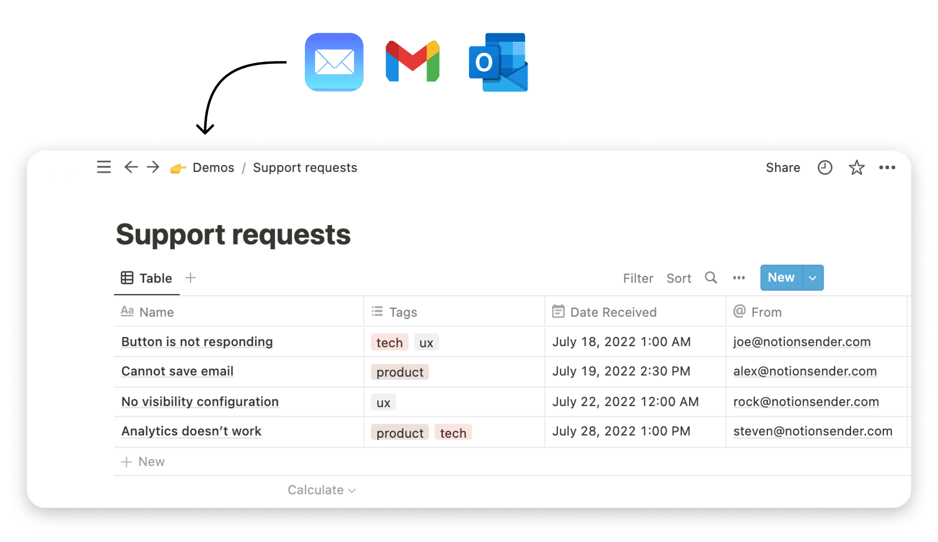
Automate Your Lead Capture with NotionSender
Getting that email sign-up is a great first step, but what happens next is what truly matters. How you handle that new lead is the difference between a future loyal customer and just another forgotten name on a spreadsheet. This is where you can stop the mind-numbing manual work and build an efficient system that pipes new subscribers directly from your sign-up sheet into your workflow.
Let's put an end to the tedious copy-and-paste routine from form responses into Notion. With a tool like NotionSender, you can build a seamless bridge between your sign-up form and your Notion workspace. We're talking about saving hours of admin time and making sure no lead ever slips through the cracks again. It's more than just a time-saver; it’s about creating a responsive, real-time engine for managing your leads.
How the Automation Actually Works
The idea behind this is surprisingly straightforward, yet incredibly effective. NotionSender gives you a unique, dedicated email address for each of your Notion databases. All you have to do is set this special address as the recipient for your Google Form's email notifications.
So, every time someone signs up, Google Forms fires off its usual notification email. But instead of cluttering your personal inbox, it lands directly with NotionSender. The service then intelligently reads the info from that email and, like magic, creates a new, perfectly organized entry in the Notion database you specified.
This whole process essentially builds a direct pipeline for your leads.
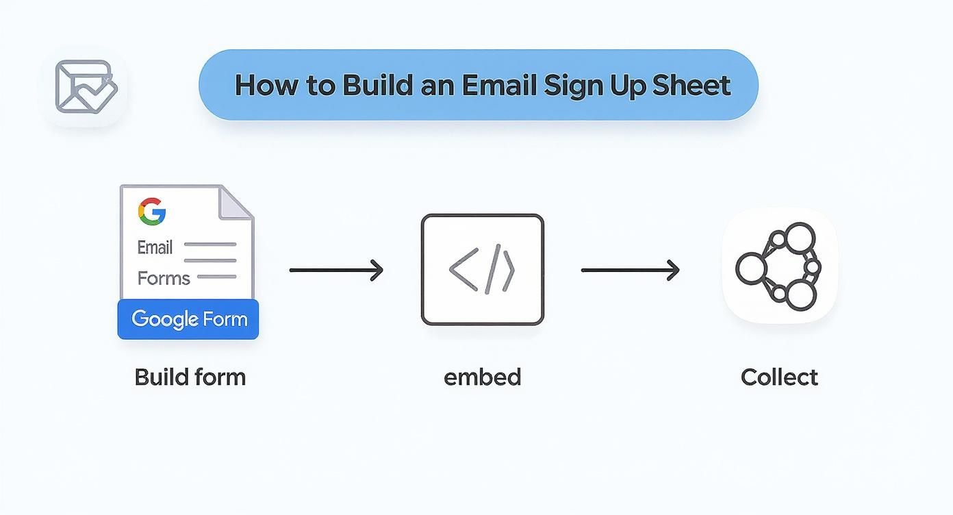
As you can see, you build the form, embed it where your audience is, and new subscribers are automatically collected and sorted in Notion without you lifting a finger.
To really see the difference, let’s compare the old way with this new automated flow.
Manual vs Automated Lead Capture into Notion
This table breaks down the traditional, hands-on process of getting leads into Notion versus the automated workflow using NotionSender. The contrast in efficiency and reliability is pretty stark.
| Process Step | Manual Method | Automated Method with NotionSender |
|---|---|---|
| New Lead Submitted | Receive an email notification in your personal inbox. | Google Form notification is sent directly to the unique NotionSender email address. |
| Data Transfer | Manually open Notion, find the right database, and create a new entry. | NotionSender automatically parses the email content. |
| Data Entry | Copy and paste the name, email, and other details from the email into Notion properties. | A new entry is instantly created in the designated Notion database with all fields correctly populated. |
| Potential for Error | High. Typos, missed leads, and inconsistent formatting are common. | Minimal. The process is standardized, ensuring data accuracy and consistency. |
| Time to Process | Minutes per lead, which adds up quickly. | Instantaneous. The lead is in Notion the moment they sign up. |
| Follow-up Trigger | Delayed. You can only act on the lead after you've manually entered it. | Immediate. The lead is ready for automated follow-ups or manual outreach right away. |
The takeaway is clear: automation isn't just about convenience—it's about creating a more robust, scalable, and error-proof system for managing your most valuable asset: your audience.
Setting Up Your Notion Database
Before you can connect anything, your new leads need a place to live. The first thing you'll want to do is create a fresh database in Notion. This will become your master list of subscribers.
To make the automation click, you need to set up the right properties in your database. Think of these properties as the landing spots for the data coming in from your form.
- Name: A simple "Title" property is perfect for the subscriber's name.
- Email: Create an "Email" property to house their contact address.
- Source: I highly recommend adding a "Select" or "Text" property called "Source." This is invaluable for tracking where people are coming from (e.g., "Website Pop-up," "Blog Post Footer," "Link in Bio").
This simple structure ensures that when NotionSender gets the notification email, it knows exactly where to file each piece of information.
Connecting the Dots with NotionSender
With your Notion database prepped and ready, the last step is to make the connection. Inside NotionSender, you’ll link your Notion account and point it to the database you just created. From there, you just need to map the fields.
You’re essentially telling the system, "When an email comes in, take the line labeled 'Name' from the form and put it into my 'Name' property in Notion." This mapping is the secret sauce that makes the automation so precise.
Once set up, your simple email sign up sheet transforms into a fully automated lead capture machine. Every new subscriber is instantly and accurately logged, ready for you to start building a relationship.
For a deeper dive into the setup and more advanced options, you can always check out the technical details in the NotionSender API documentation.
Building Trust After They Sign Up
Getting someone's email address is just the first step. It's a transaction. The real work—building a relationship that leads to long-term engagement—starts now.
Those first few moments after they hit "subscribe" are your golden opportunity to make a great first impression and prove they made the right choice. This is where you shift from just collecting data to actually building an audience.
It all begins with respecting the information they just gave you. Think of regulations like GDPR not as a headache, but as a framework for building trust. Being upfront about how you handle their data and getting clear consent isn't just a legal box to tick; it’s the foundation of a healthy relationship with your subscribers.
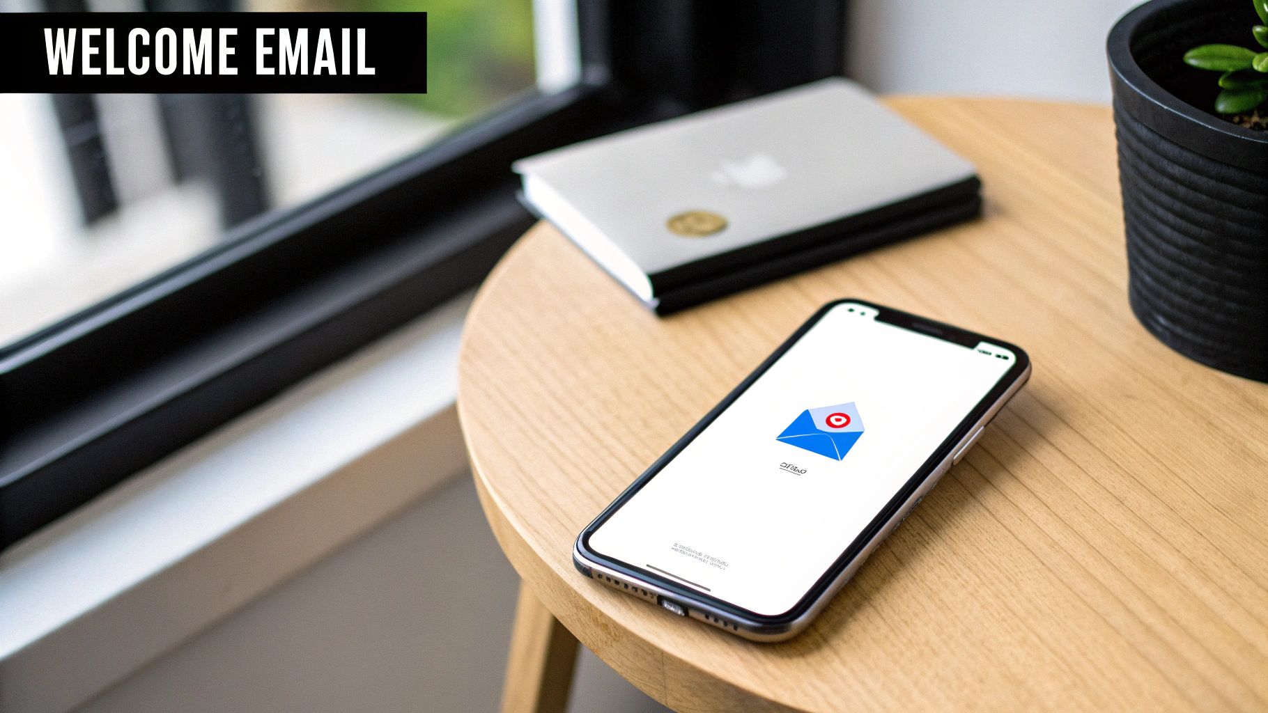
The Power of the Welcome Email
If you only perfect one email, make it your welcome email. Seriously. It consistently gets the highest open rates of any message you'll ever send, so you can't afford to waste it.
A killer welcome email does a few things really well:
- Confirms the sign-up: Instantly lets them know it worked. No "did I do that right?" anxiety.
- Delivers the goods: If you promised a PDF, a discount code, or a free template, hand it over immediately.
- Sets the scene: Tell them what to expect. How often will you email them? What kind of stuff will you be sending?
- Shows your personality: Briefly share what you're all about. This is your chance to build a genuine connection.
This first touchpoint is absolutely critical. For a deeper dive, check out our guide on how to send the perfect email to get the response you want.
Smart Segmentation from Day One
Here's a hard truth: a small, engaged list is infinitely more valuable than a massive, silent one. The single best way to keep people engaged is to send them stuff they actually care about. That’s where segmentation comes in, and it starts right on your sign-up form.
Even one simple data point can make a huge difference. For instance, if you ask whether their primary interest is "Marketing Tips" or "Sales Strategies," you can drop them into the right bucket from the get-go. This allows you to tailor your emails and ensure you're not just adding to the noise in their inbox.
Remember, personalization is more than just using a
{{first_name}}tag. It's about sending the right message to the right person at the right time. That’s what keeps people opening your emails instead of hitting unsubscribe.
The numbers don't lie. With average email open rates hovering around 35.63% and click-through rates at 2.6%, every little optimization counts. And since somewhere between 26-78% of all emails are opened on a phone, your entire process—from the sign-up sheet to the welcome email—has to be mobile-friendly. To get more context on these numbers, you can read a detailed breakdown of email marketing engagement on Hostinger.com.
Common Questions About Email Sign Up Sheets
https://www.youtube.com/embed/DcKbBKSRZaw
When you're building out an email sign-up sheet, you'll probably run into the same handful of questions that everyone else does. But getting these small details right from the start can be the difference between a list that grows and one that stagnates.
Let's dig into a couple of the most common sticking points I see people grapple with.
Where Should I Actually Put My Email Sign Up Form?
This one comes up all the time. While there’s no single "magic" spot, the core principle is visibility. You want to make subscribing feel like a natural, easy next step for someone who’s already enjoying your content—not a treasure hunt.
Think about the user's journey on your site. Where are they most engaged? That's where your form should be.
Here are a few high-impact locations that work well:
- Header or Top Bar: This is prime real estate. It keeps your offer front-and-center on every single page.
- Within Blog Posts: Catch people right when they're hooked on your content and thinking, "I like what this person has to say."
- Website Footer: It's a classic for a reason. People who are actively looking to subscribe often scroll down to the footer by instinct.
- Exit-Intent Pop-up: This is your last-ditch effort to connect with someone as they're about to leave. When done right, it can be surprisingly effective.
Another powerful play is to create a dedicated landing page for your newsletter and link to it directly from your social media profiles.
How Many Fields Should My Form Have?
The golden rule here is as simple as it gets: less is more.
For most newsletters, all you really need to get the ball rolling is an email address. That's it.
Every additional field you add creates friction and will absolutely lower your conversion rate. Only ask for information you have a clear and immediate plan to use.
Sure, adding a "First Name" field allows for personalization, but you have to weigh that against the potential drop-off. If you're not actually going to use their name in your emails, don't ask for it. A good benchmark for sign-up form conversion rates is between 1-5%, so every little bit of optimization counts.
Ready to turn your sign-up form into an automated lead-capture machine? With NotionSender, you can connect your form directly to Notion, saving every new subscriber automatically without any manual data entry. Start automating your workflow today